
Guides
Choose your colors and customize quick access
Make Invemory comfortable to read on the website and in the Android app. Choose or create a palette, adjust priority and photo indicators, and set the quick access handle’s colors, transparency and position. You can also choose an appearance for public pages before signing in.
Last checked:
What you need
- Sign in to Invemory on the website or in the installed Android app to customize personal palettes and quick access. You can choose a public website scheme without an account.
- To check priority colors, you need purchase needs in a basket; for photo indicators, use an item with several photos. Change only data you can access.
1. Open Appearance and choose a scheme
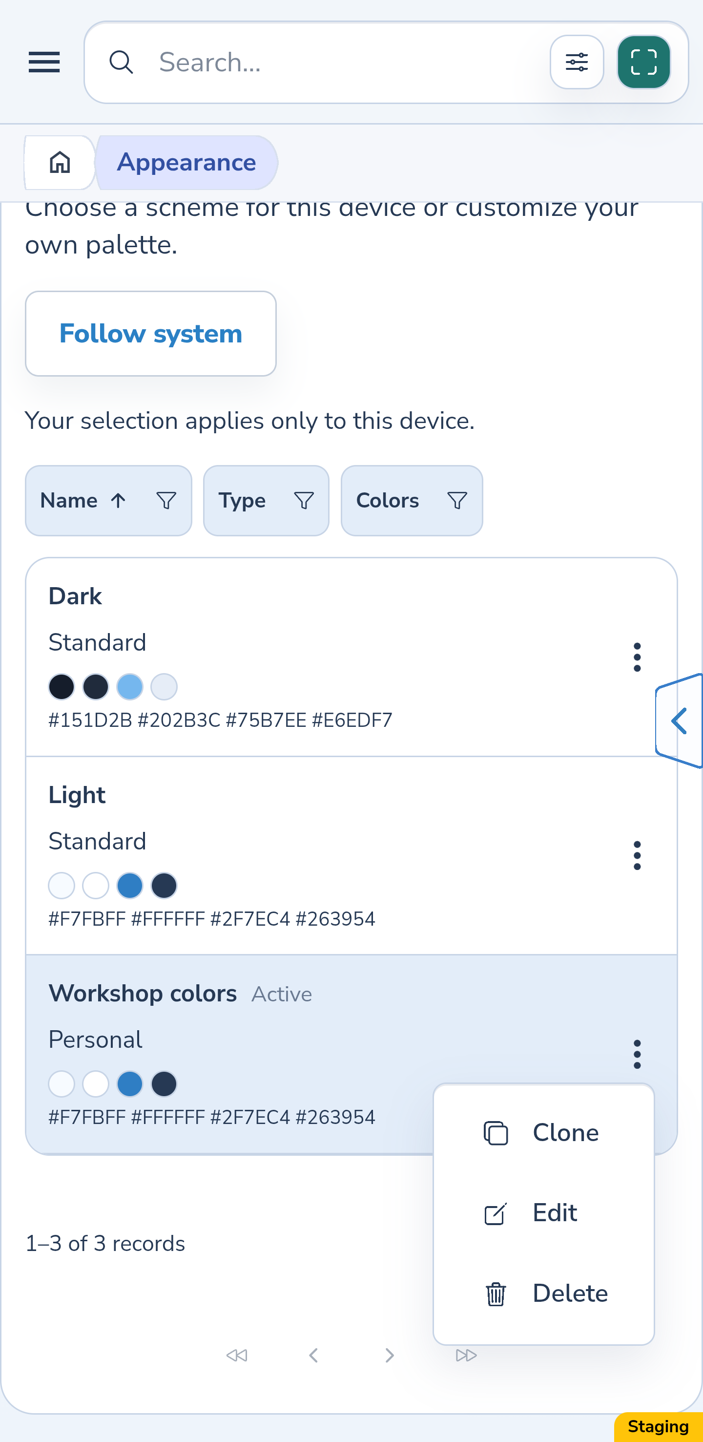
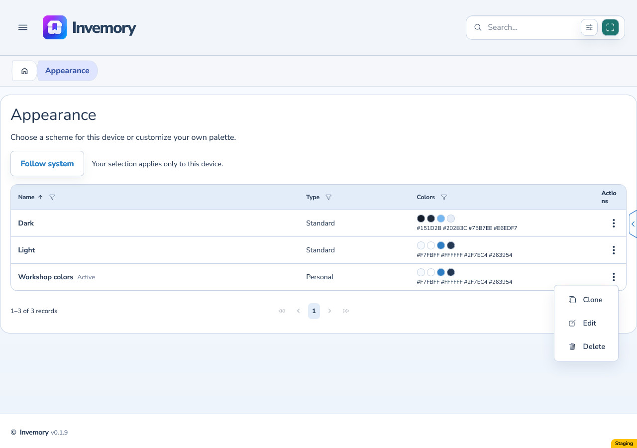
In the main menu, choose Profile → Appearance. On a phone, open the menu with the three-line button first; on the wide website, use the sidebar.
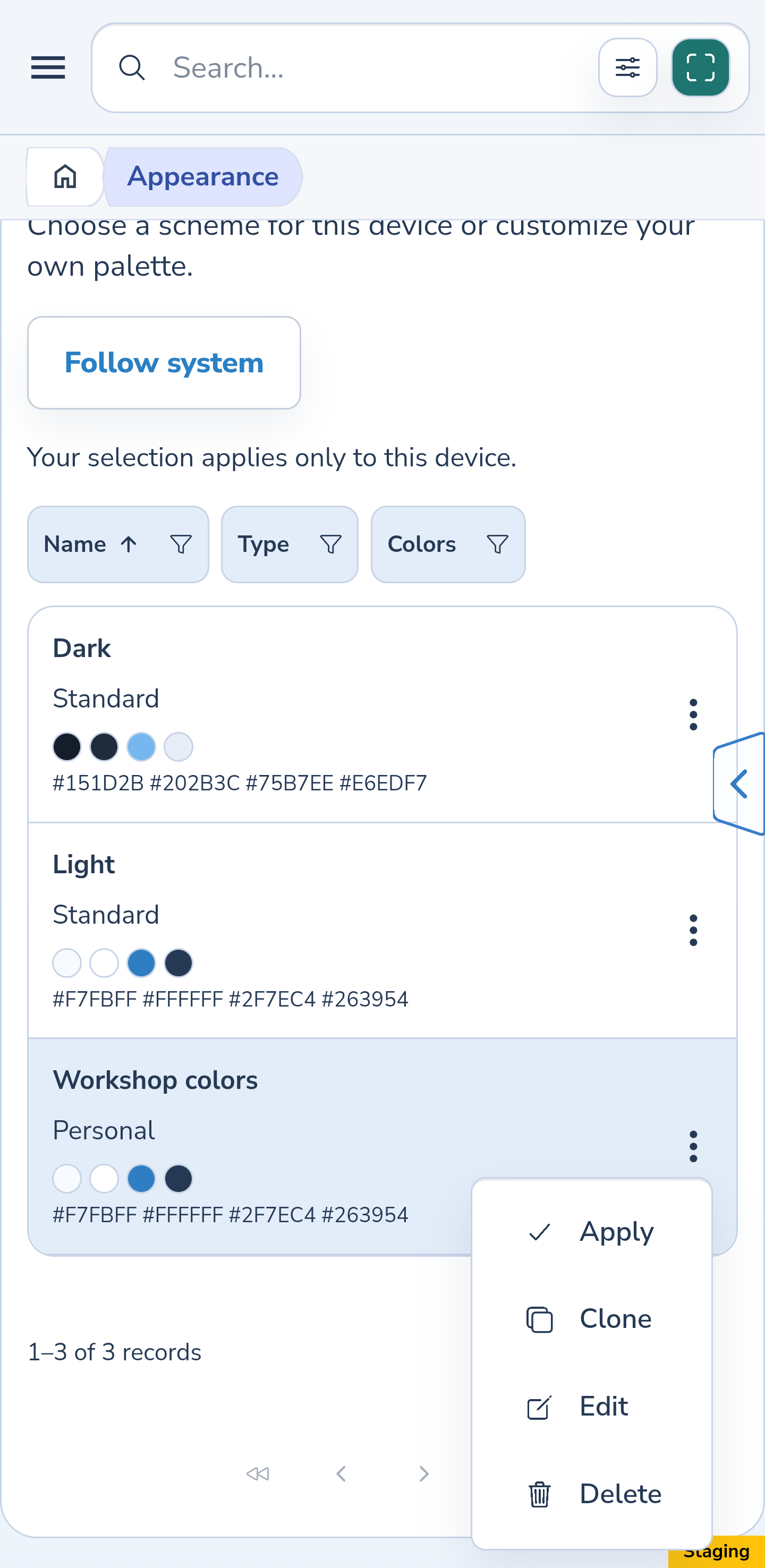
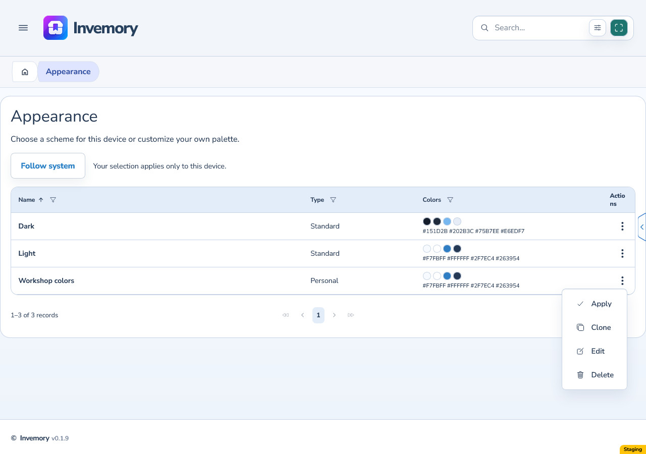
Open the actions menu beside the standard Light or Dark scheme, or a saved personal palette, and choose Apply. Active identifies the selected palette. Follow system uses the light or dark appearance set by your operating system. Your selection applies to this device.
Android
Website
2. Create a personal palette from an existing scheme
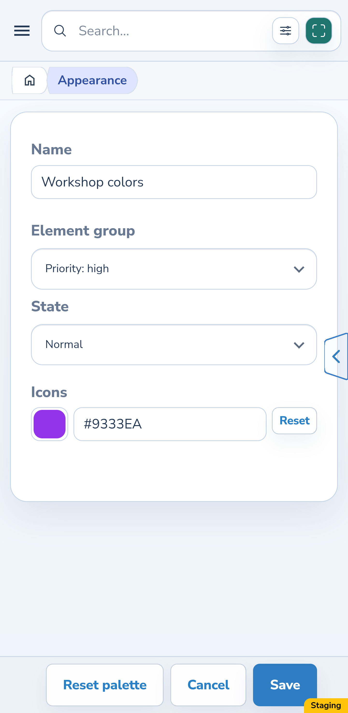
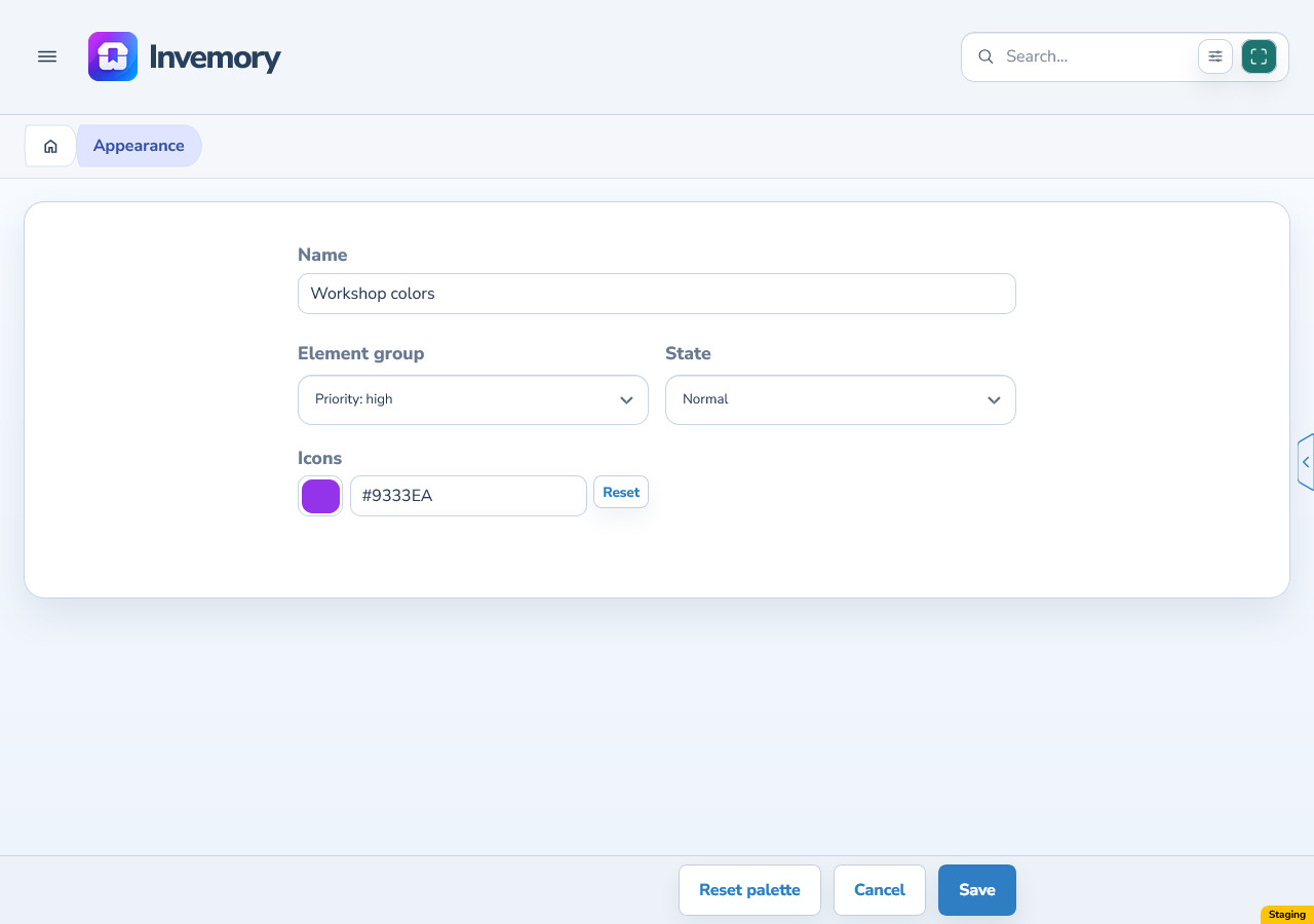
Choose Clone in a scheme’s menu. The copy starts with the same colors and light or dark base type. Enter a clear, distinct Name. To change an existing personal palette, choose Edit.
Choose an Element group, then a State. The editor shows the fields available for that combination, such as Background, Text, Icons or Border. Use the color control or enter a #RRGGBB or #RRGGBBAA code. Valid changes appear in the preview immediately; they have not been saved yet.
Reset beside a field restores its color from the standard scheme with the same base type. Reset palette does this for all palette colors. These are editor changes, so check the result before saving.
Android
Website
3. Choose a color with the picker
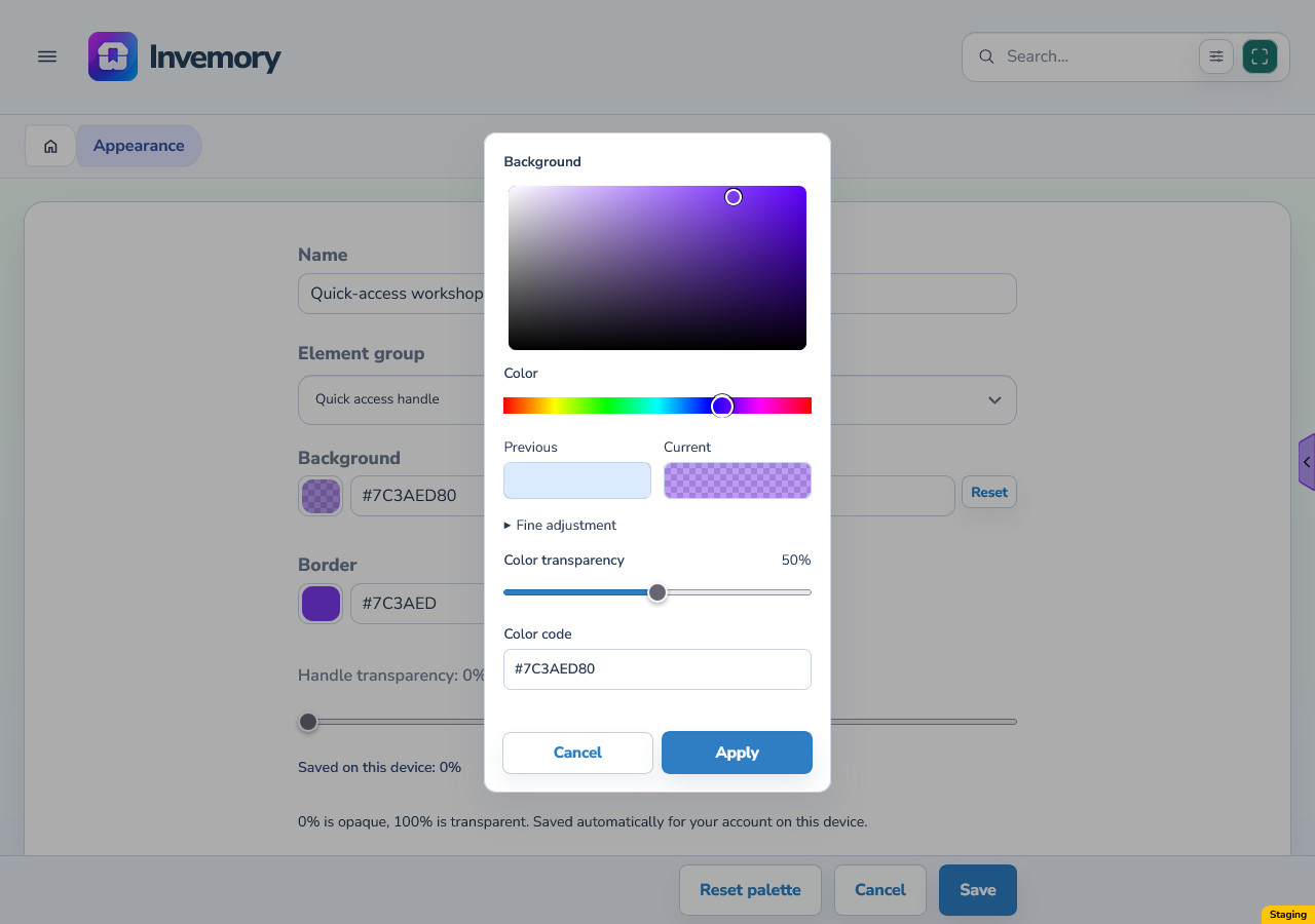
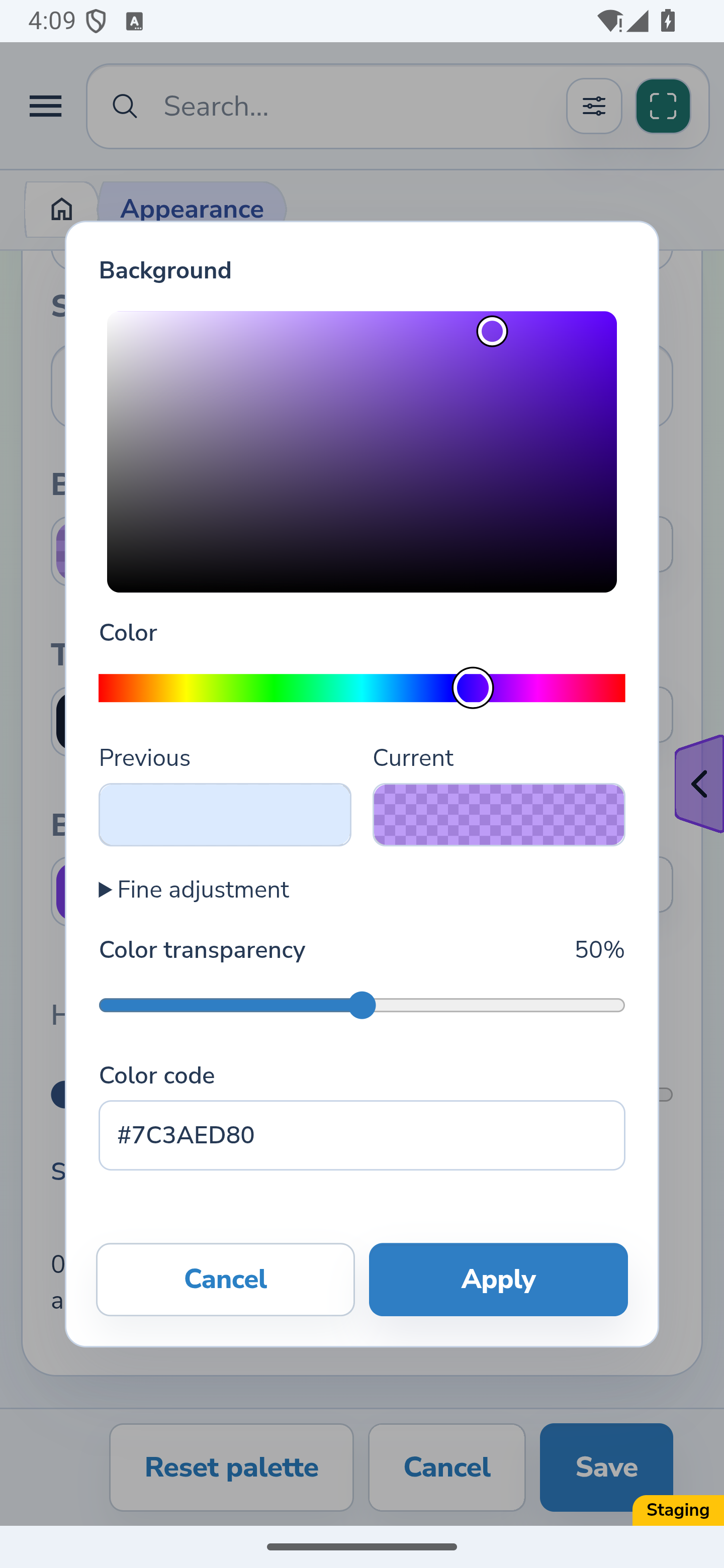
In a personal palette editor, select the colored square beside a field. Use the rainbow Color slider to choose a hue, then click or drag in the color area to set saturation and brightness. Current shows the color you are choosing.
Adjust Color transparency or enter a Color code in #RRGGBB or #RRGGBBAA format. The final two characters in the longer format specify opacity. Valid changes appear in the editor preview; an invalid code must be corrected before Apply becomes available.
Website
Android
4. Make precise adjustments
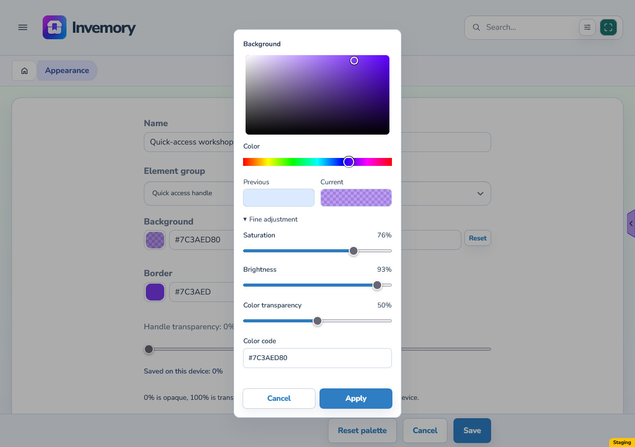
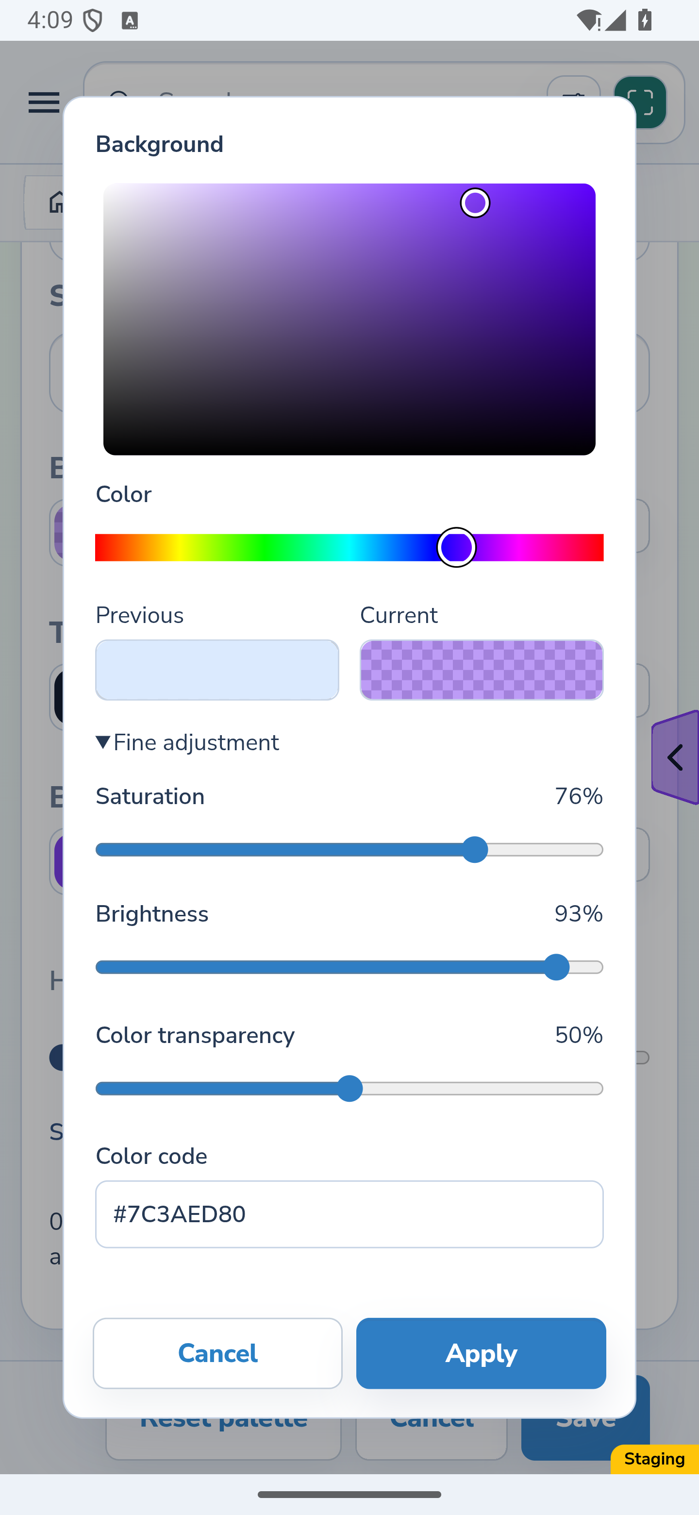
Expand Fine adjustment to use the separate Saturation and Brightness sliders. The color area, sliders, Current sample and valid Color code stay in sync.
Color transparency belongs to this color. It is separate from the Handle transparency control described below.
Website
Android
5. Restore the color you started with
Select the Previous sample to restore the color and transparency from when you opened the picker. The dialog stays open so you can continue adjusting it.
Cancel or dismiss the picker by clicking outside it to restore that same opening value. After Apply, reopening the picker starts with the current editor value, including its transparency.
6. Keep the color, then save the palette
Apply in the picker closes the dialog and keeps the chosen color in the palette draft. Use Save in the palette editor to store the palette.
For a new or inactive palette, return to the list and choose Apply from its menu to use it. Picker Apply, palette Save and list Apply serve these separate steps.
7. Save the palette and apply it
Choose Save and wait for the list to return with “Palette saved.” Saving a new copy or editing an inactive palette does not activate it: open its menu and choose Apply separately.
Saving an already active palette keeps it selected and updates its colors. Open Edit again to check the saved values. Correct an empty or duplicate name or an invalid color code. If saving fails, your edits remain in the editor; read the message and try again once you have resolved the cause.
Android
Website
8. Set the handle’s background, arrow and border
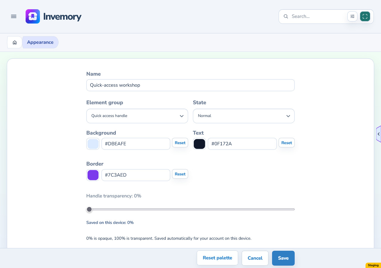
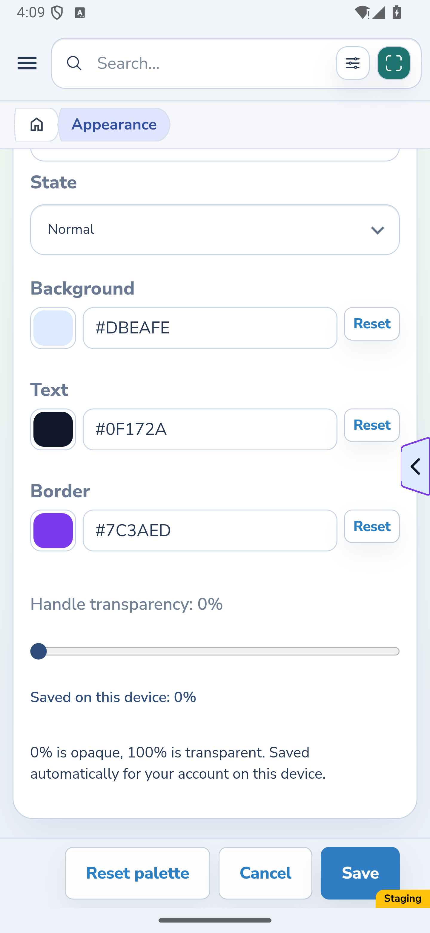
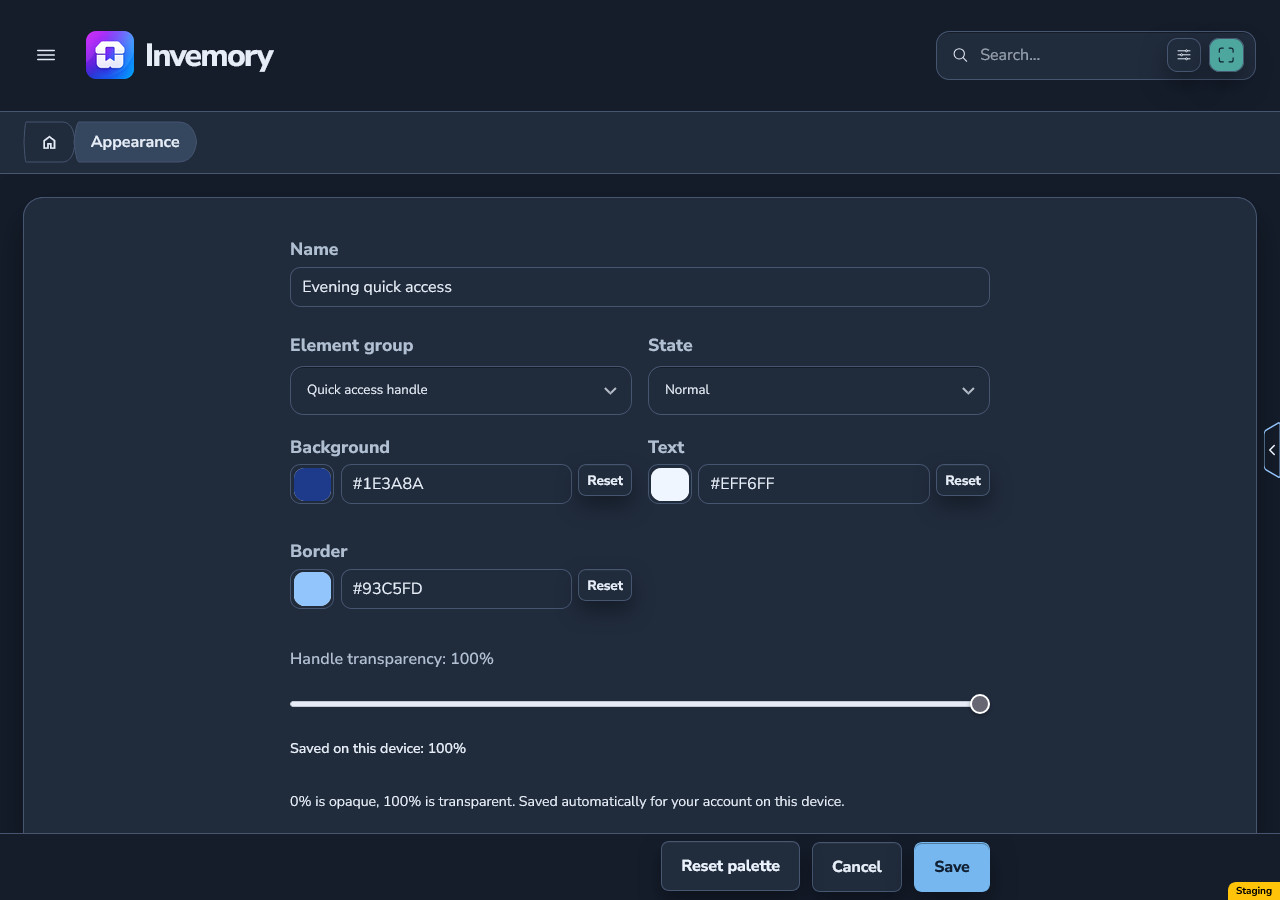
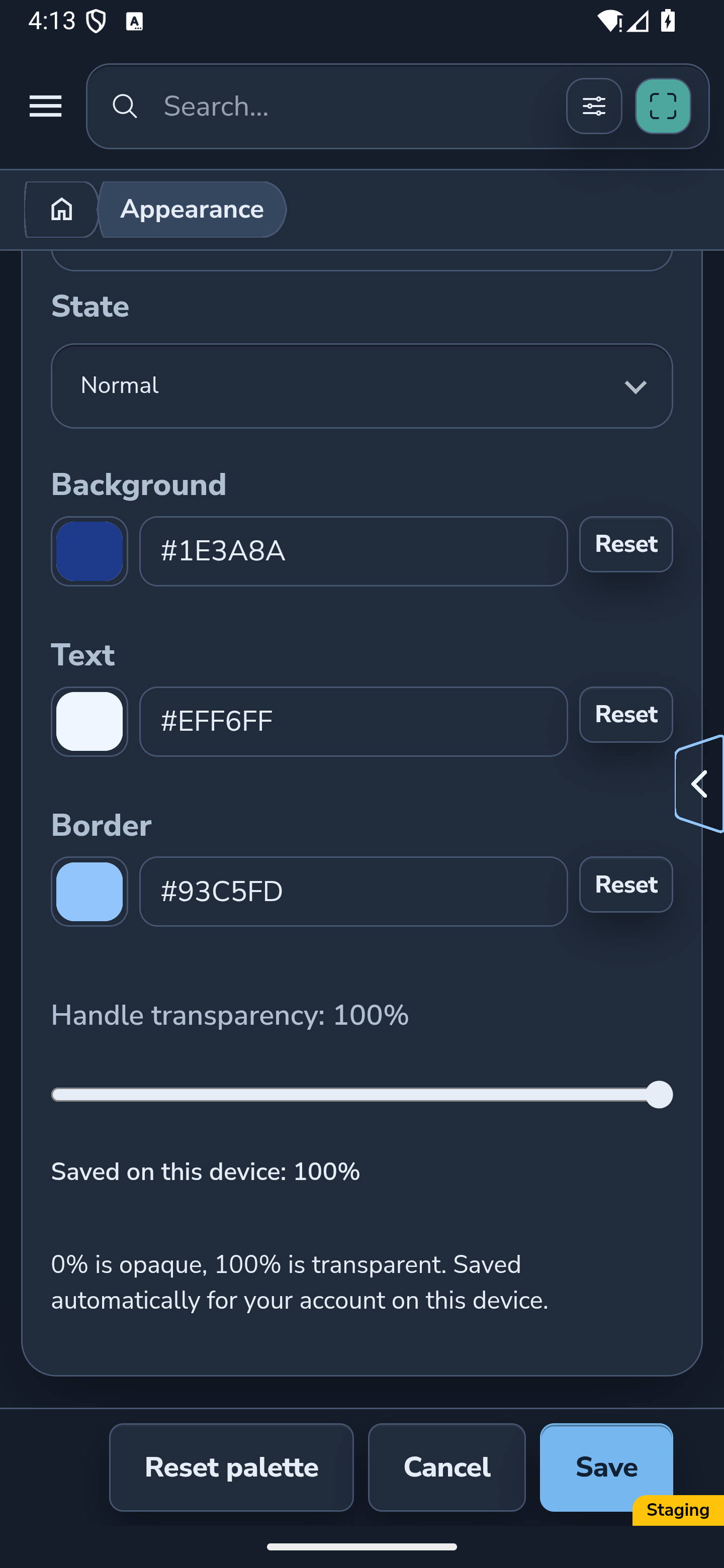
In the personal palette editor, choose Element group → Quick access handle and State → Normal. Background colors the fill, Text colors the arrow, and Border colors the outline.
Each field has its own color and Color transparency. Check the real floating handle while editing, then save the palette and apply it if needed.
Website
Android
9. Set fill transparency for this device
Use Handle transparency in the same group. At 0% the fill is opaque; at 100% it is transparent. The control affects the background and leaves the arrow and border independent of that setting.
Release the slider and wait for the saved-on-this-device message. The value saves automatically for your account on this device, separately from palette Save and Cancel.
If the website reports that transparency could not be saved, the slider and handle return to the last saved value. Change the value again to retry.
Website
Android
10. Move and open quick access
The first position is halfway down the right edge when no valid position has been saved. Press and hold the handle, then drag it to a comfortable place along the left, right, top or bottom edge. Release to remember the position for your account on this device.
Click or tap the handle to open its shortcuts. The handle stays available while you edit a palette, and your saved position is retained when you change colors.
11. Keep your draft when using a shortcut
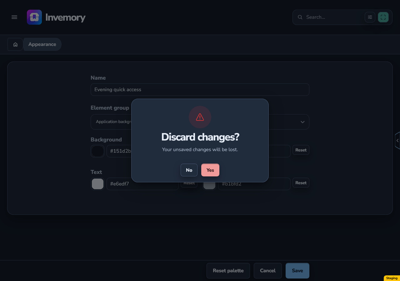
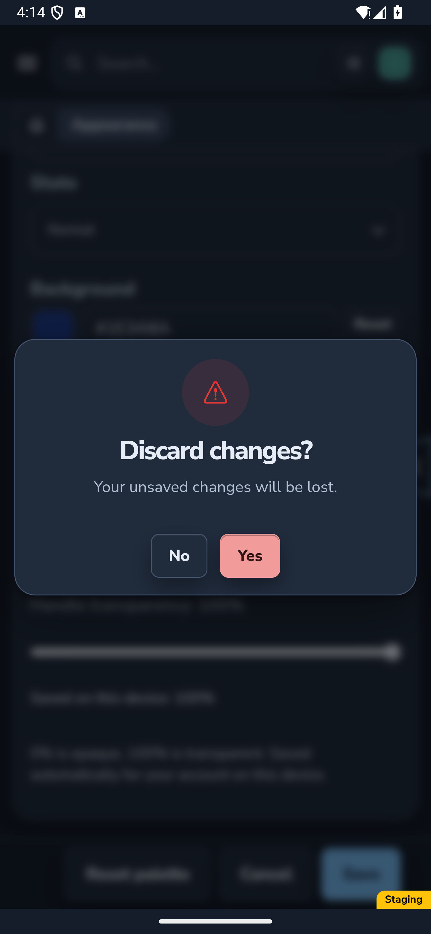
A quick access shortcut uses the usual navigation rules. If you have unsaved palette edits, leaving the editor asks whether to discard them.
Choose No to stay in the editor with your draft. Choose Yes to discard those palette edits and open the selected destination. To keep them, save the palette before leaving.
Website
Android
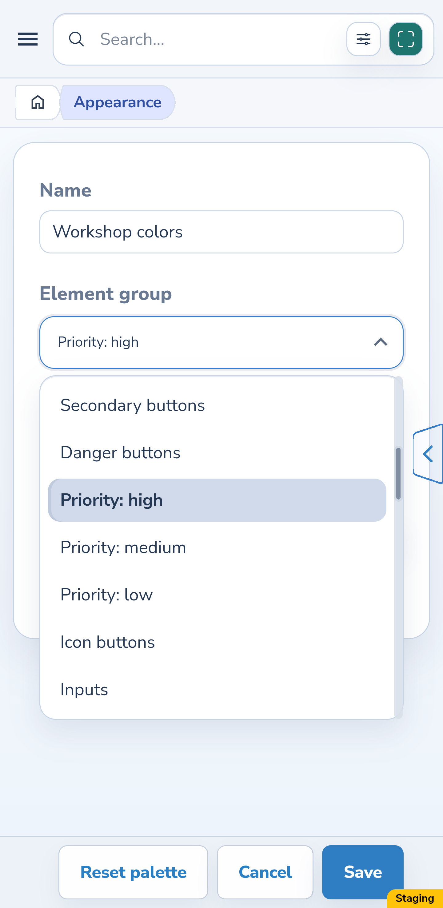
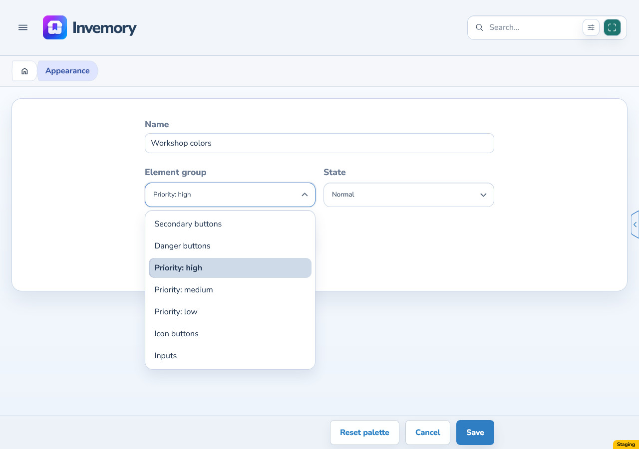
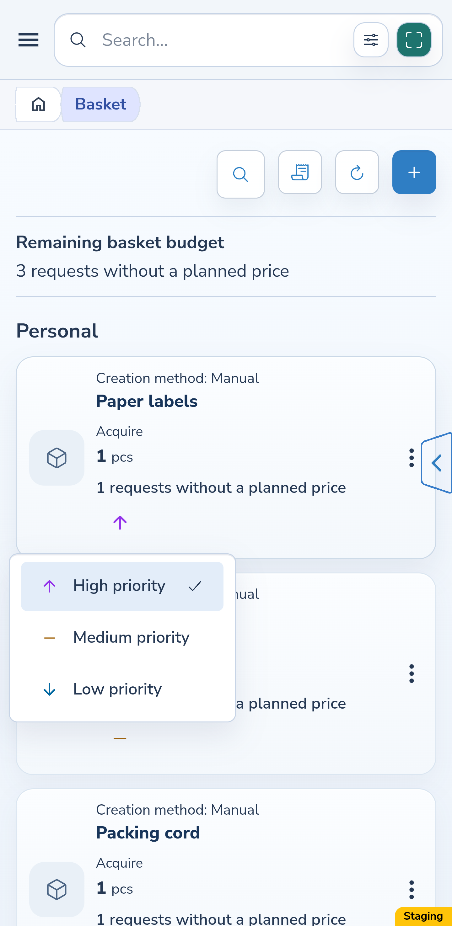
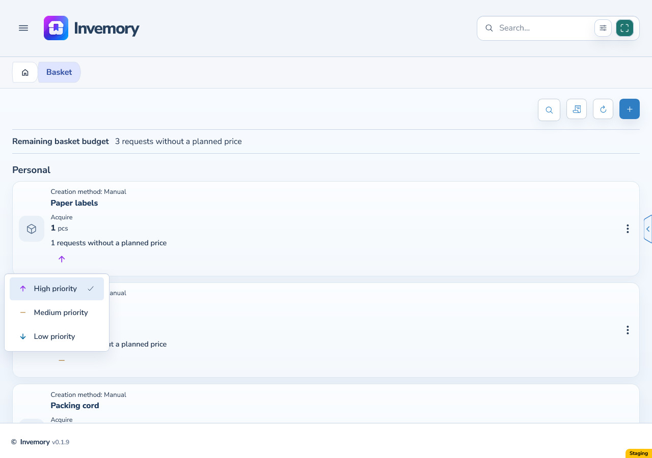
12. Set colors for the three priorities
Choose Priority: high, Priority: medium and Priority: low in turn. Each offers the Normal state and Icons field. Pick three clearly different colors, save the palette and apply it if it is not already active.
The base colors are red for high, green for medium and blue for low; Light and Dark use different shades. An administrator can update standard colors, and you can choose other colors in your personal palette. When an older palette lacks a new group, it receives a base color while your other settings are preserved.
Android
Website
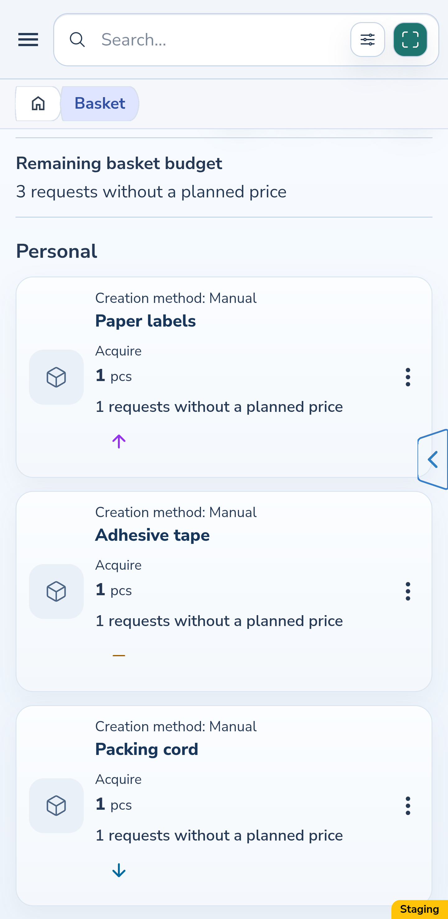
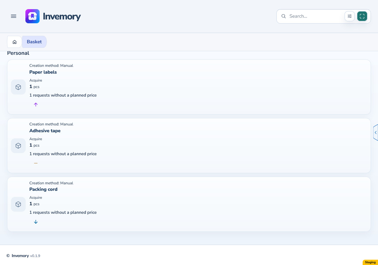
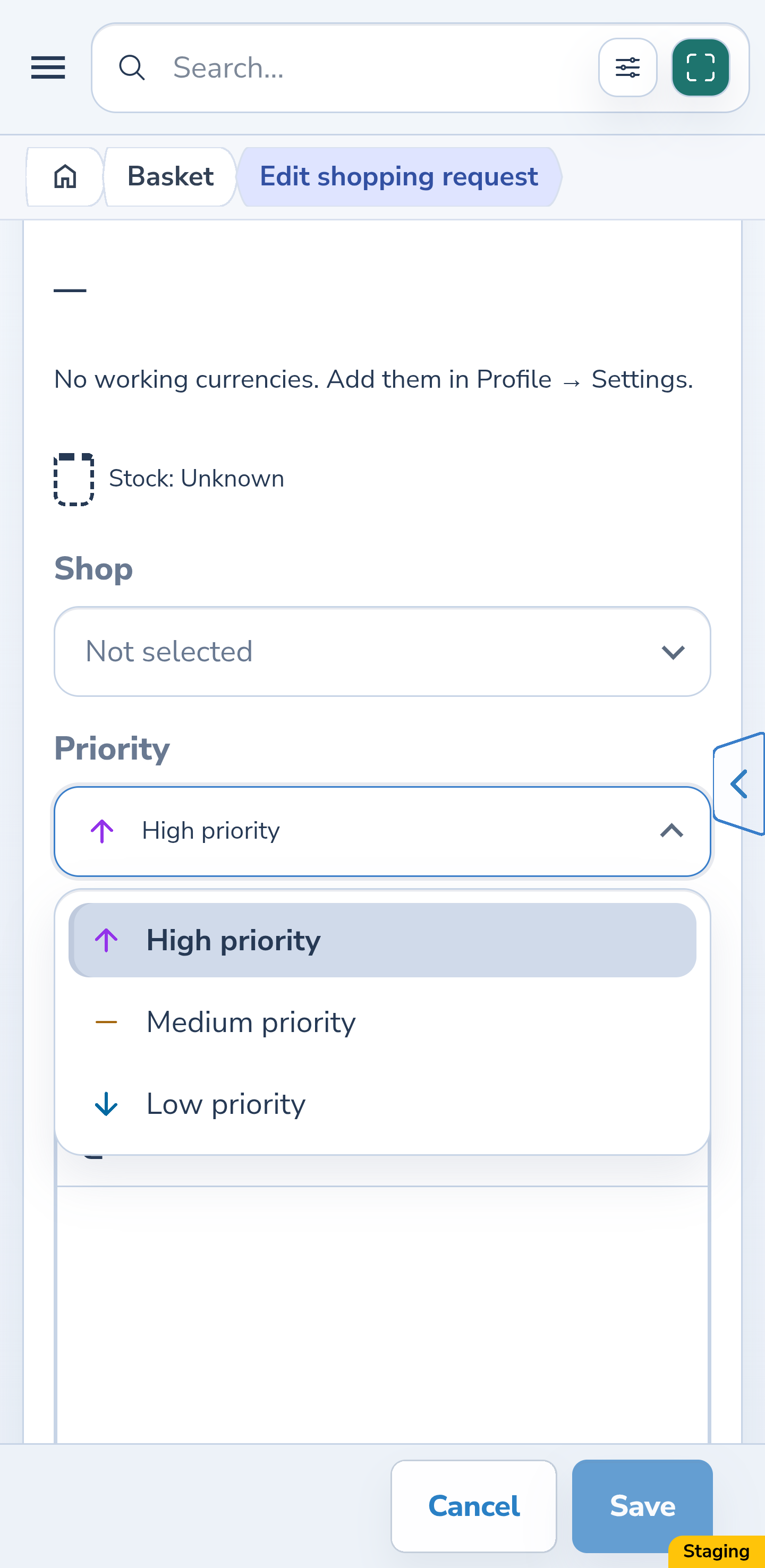
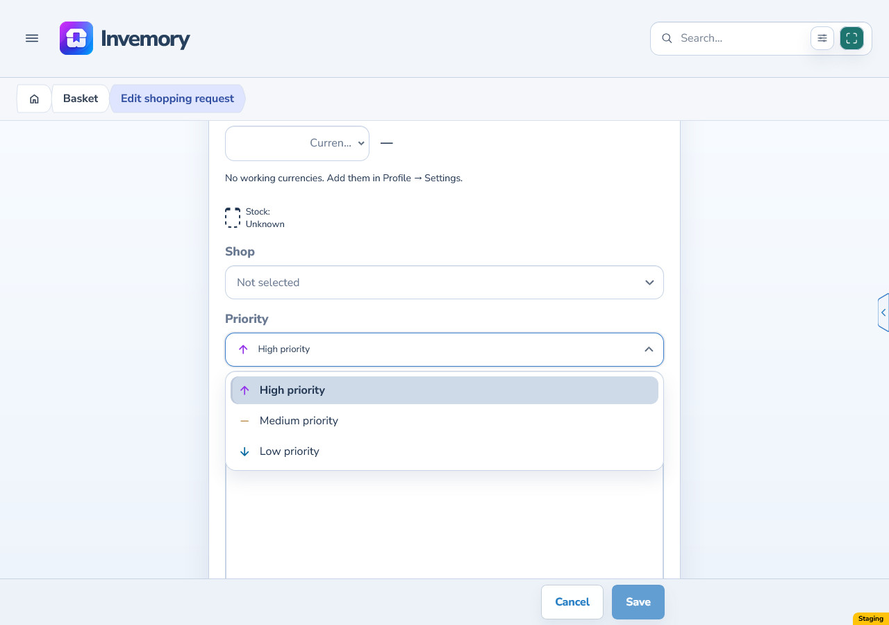
13. Check colors in the basket, editor and history
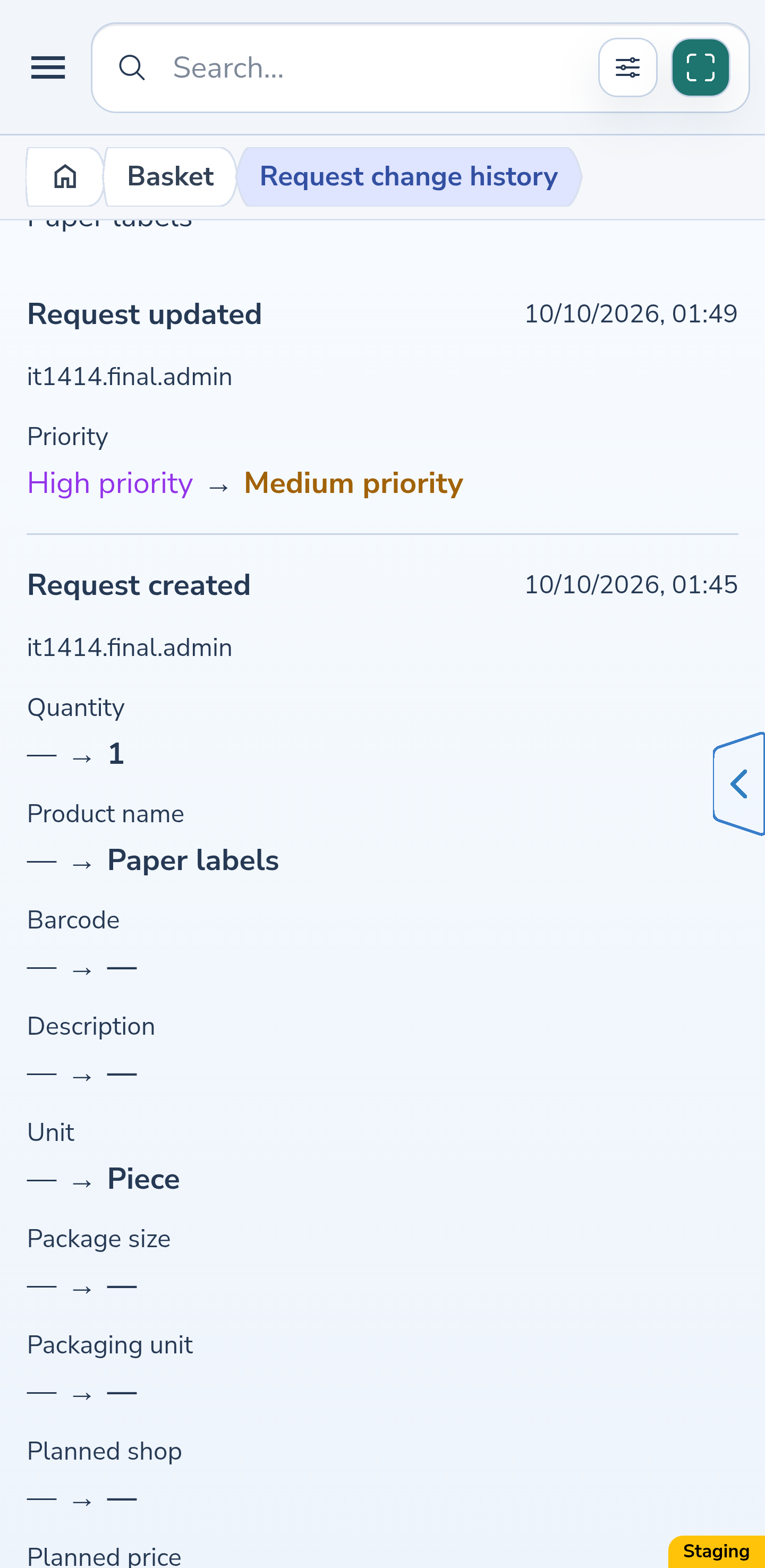
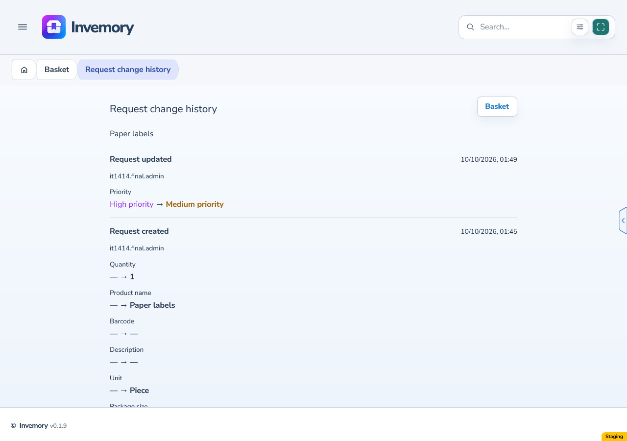
Open a basket and compare the priority indicators on its need cards. Check the priority choices in a need’s menu, then the selected value and open options in the editor. The same priority uses the same color from your current palette.
After a real priority change, open the need’s history and check the previous and new values. History keeps the values themselves; its colored indicators use your current palette. Changing a color does not change the need’s priority or mean that the event originally used that shade.
Android
Website
Android
Website
Android
Website
Android
Website
14. Change ordinary hint text below fields
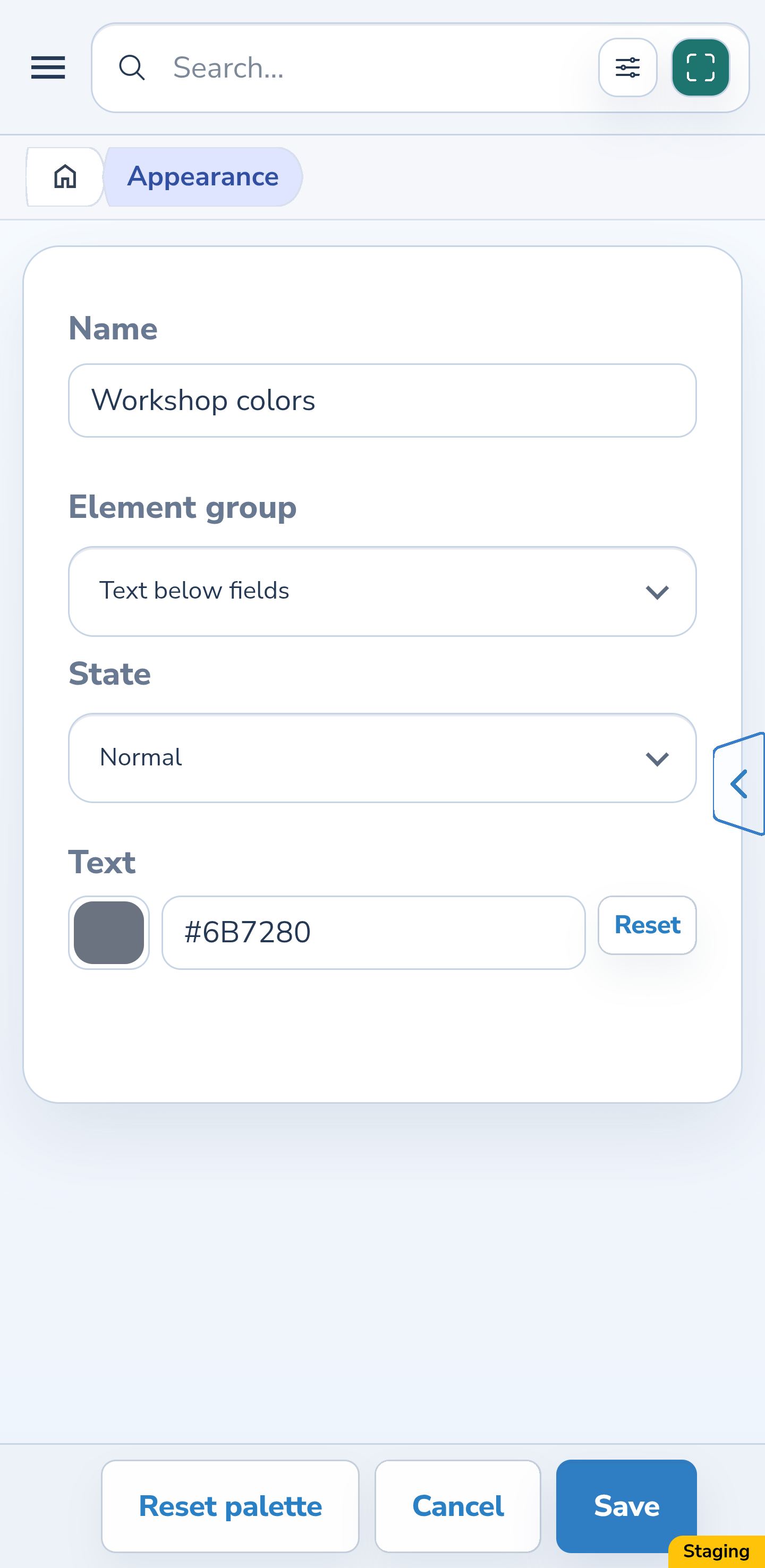
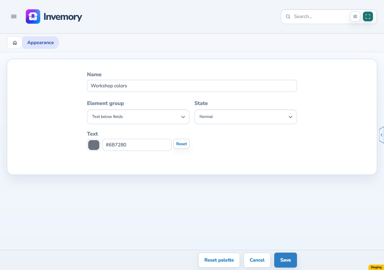
In the palette, choose Text below fields → Normal → Text. Set a color that is easy to read against the form background and save. If the palette is inactive, also choose Apply.
Check the explanation below the item name and other ordinary hints in forms or settings. This is their shared text color. Field labels, placeholders, validation errors and section descriptions have their own colors and are not changed by this group.
Android
Website
15. Customize the photo indicators separately
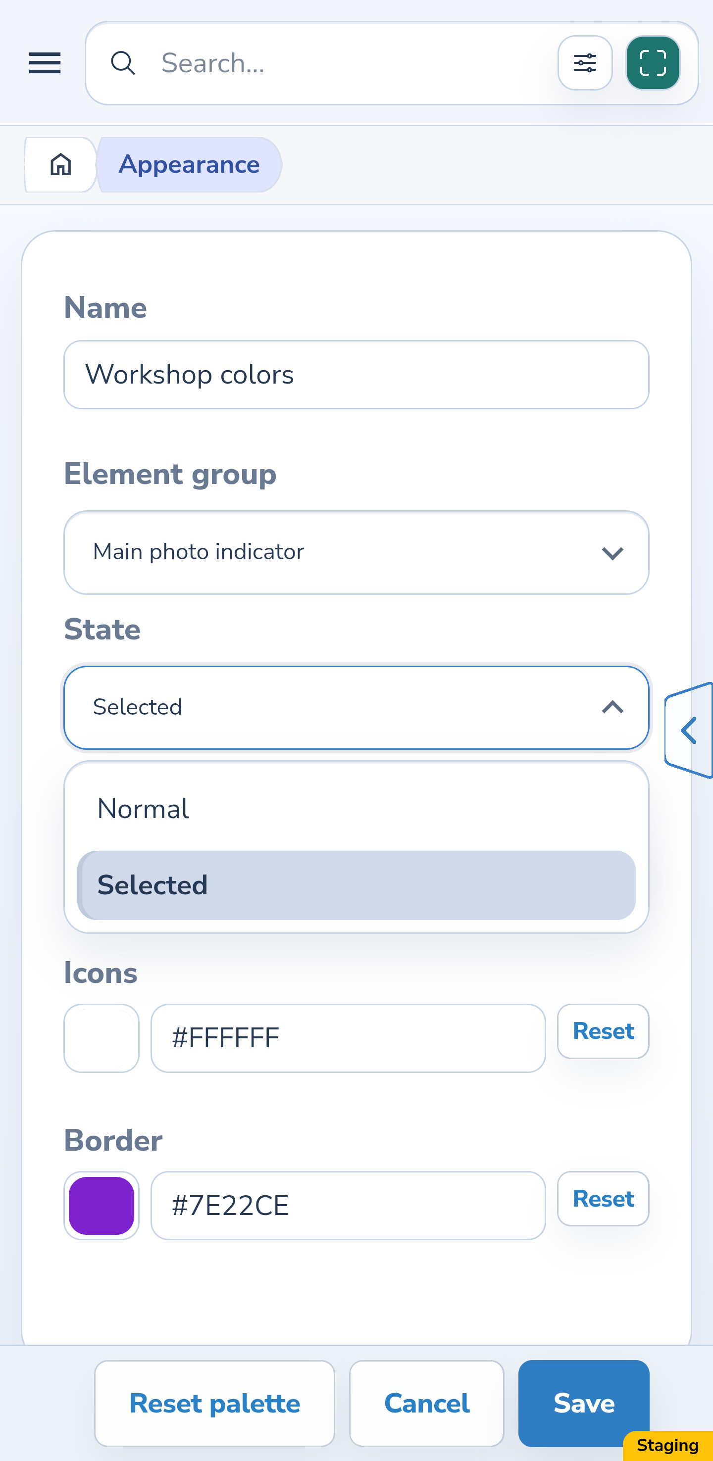
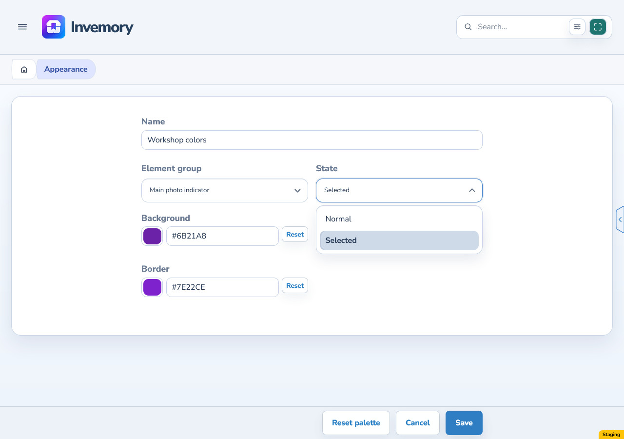
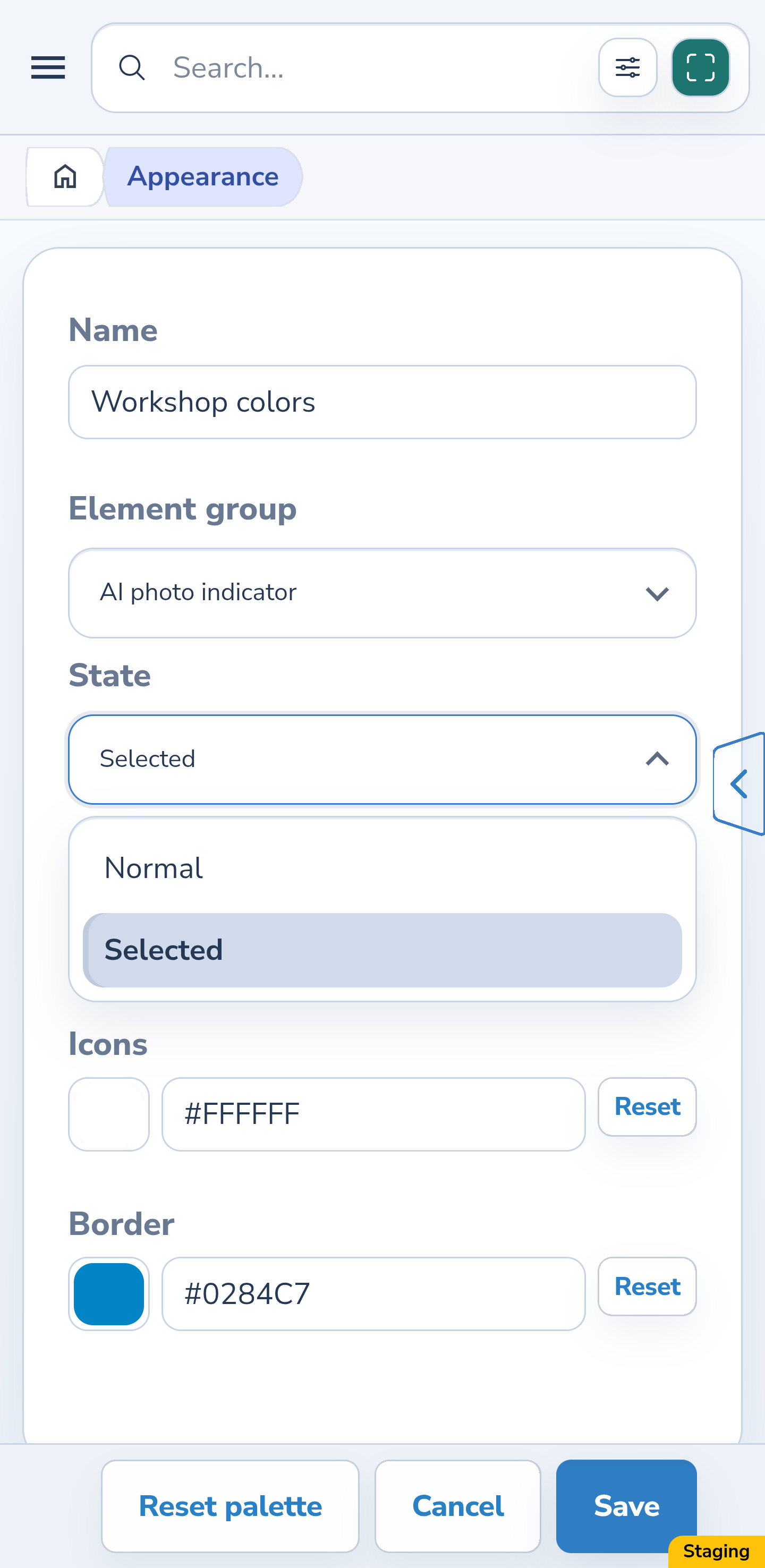
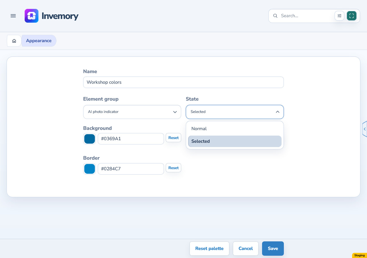
For Main photo indicator and AI photo indicator, select Normal and Selected in turn. Each state offers Background, Icons and Border. Set these colors independently so that on and off states are easy to distinguish.
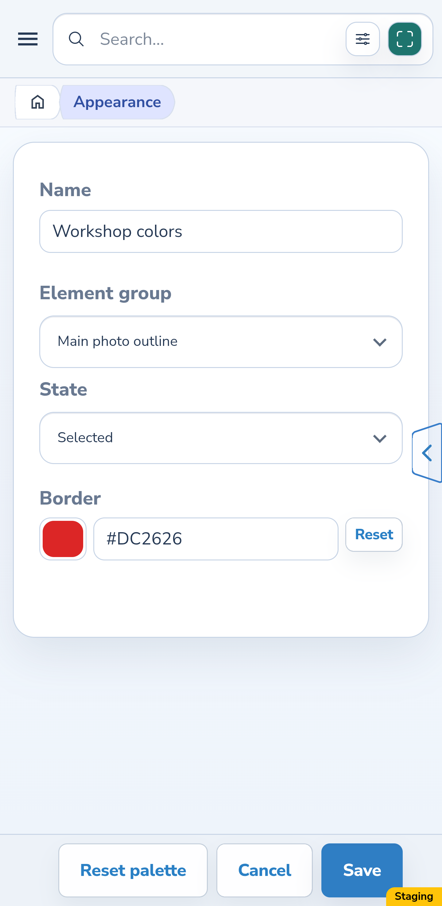
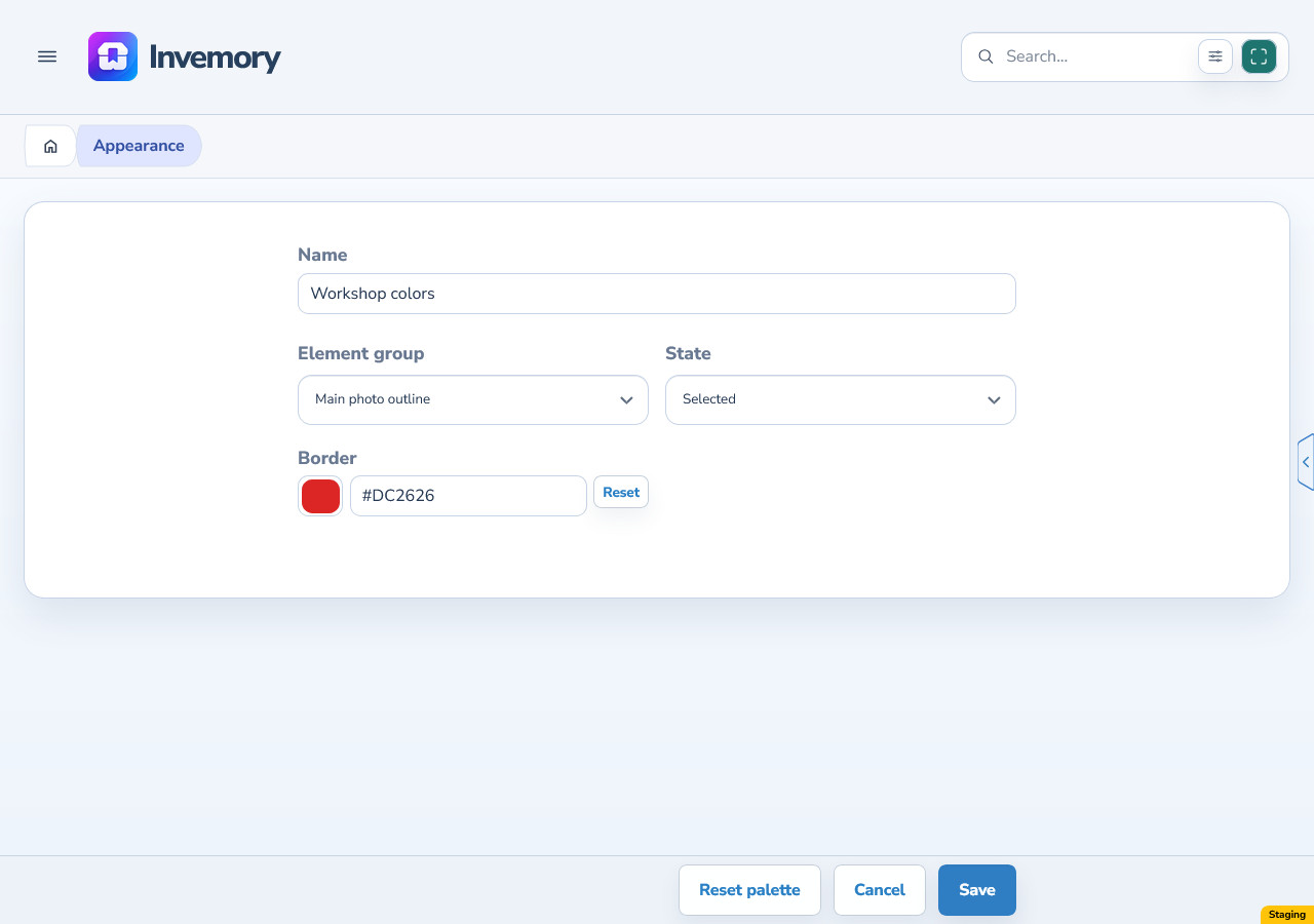
The outline around the main photo itself has a separate setting: Main photo outline → Selected → Border. Save the palette and apply it if needed. You do not need to use the indicator button’s border to color the photo outline.
Android
Website
Android
Website
Android
Website
16. Check the main photo and AI selection
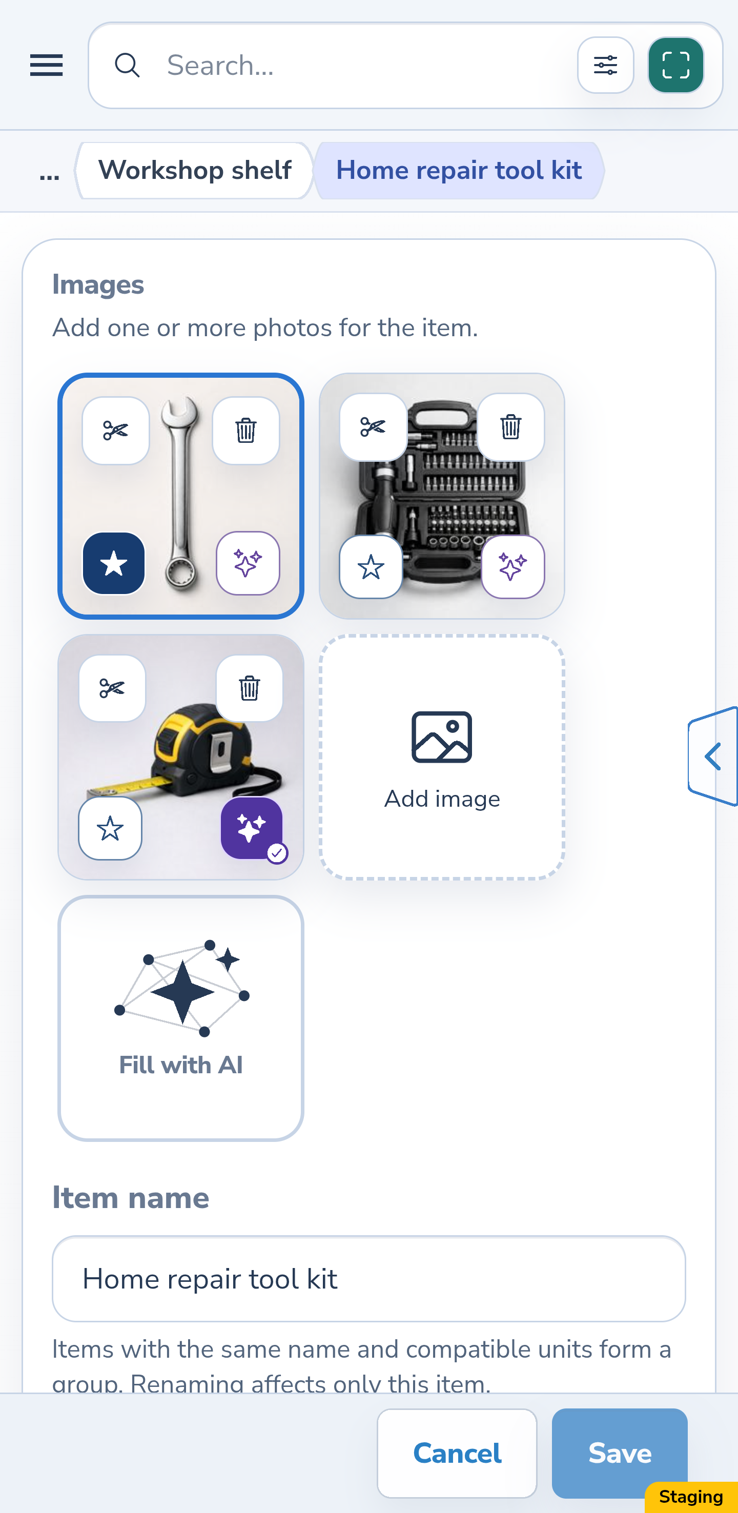
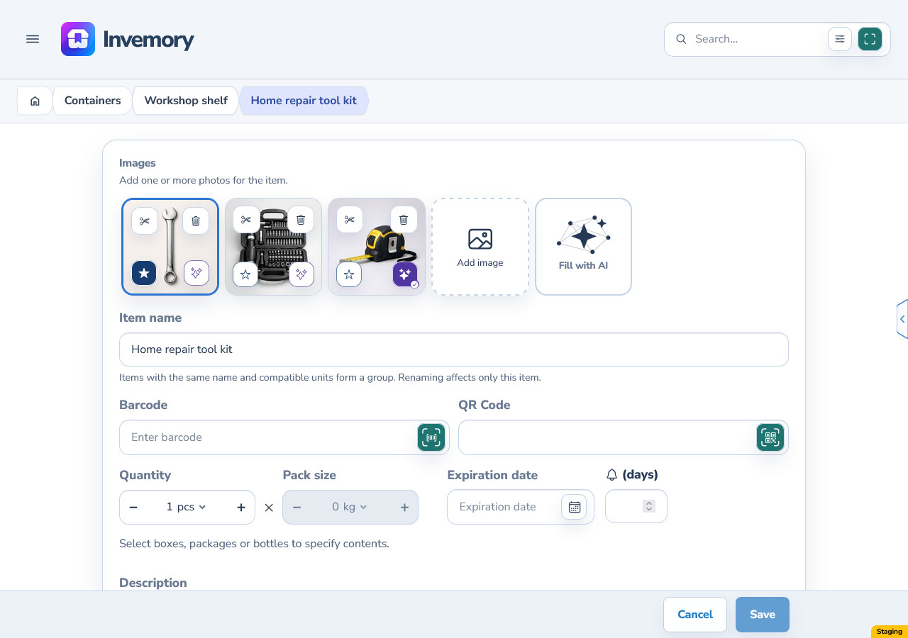
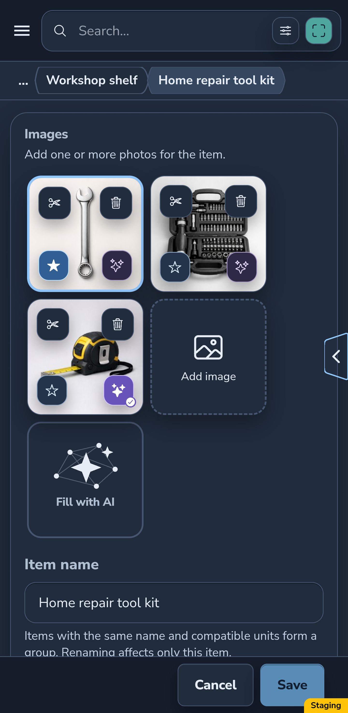
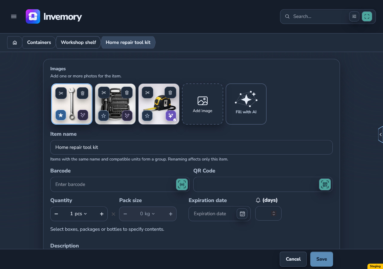
Open an item editor with several photos. The main photo has an outline and a filled star; other photos have an outline star. A photo selected for an AI request has a filled indicator with a check mark.
The two choices are independent: the main photo can be excluded from the AI request while another photo is included. The check mark indicates participation in the request, not completed analysis. Check the outline and both indicators in Light, Dark and your own colors. Forms that support only one photo do not have these toggles.
Android
Website
Android
Website
17. Cancel unsaved edits
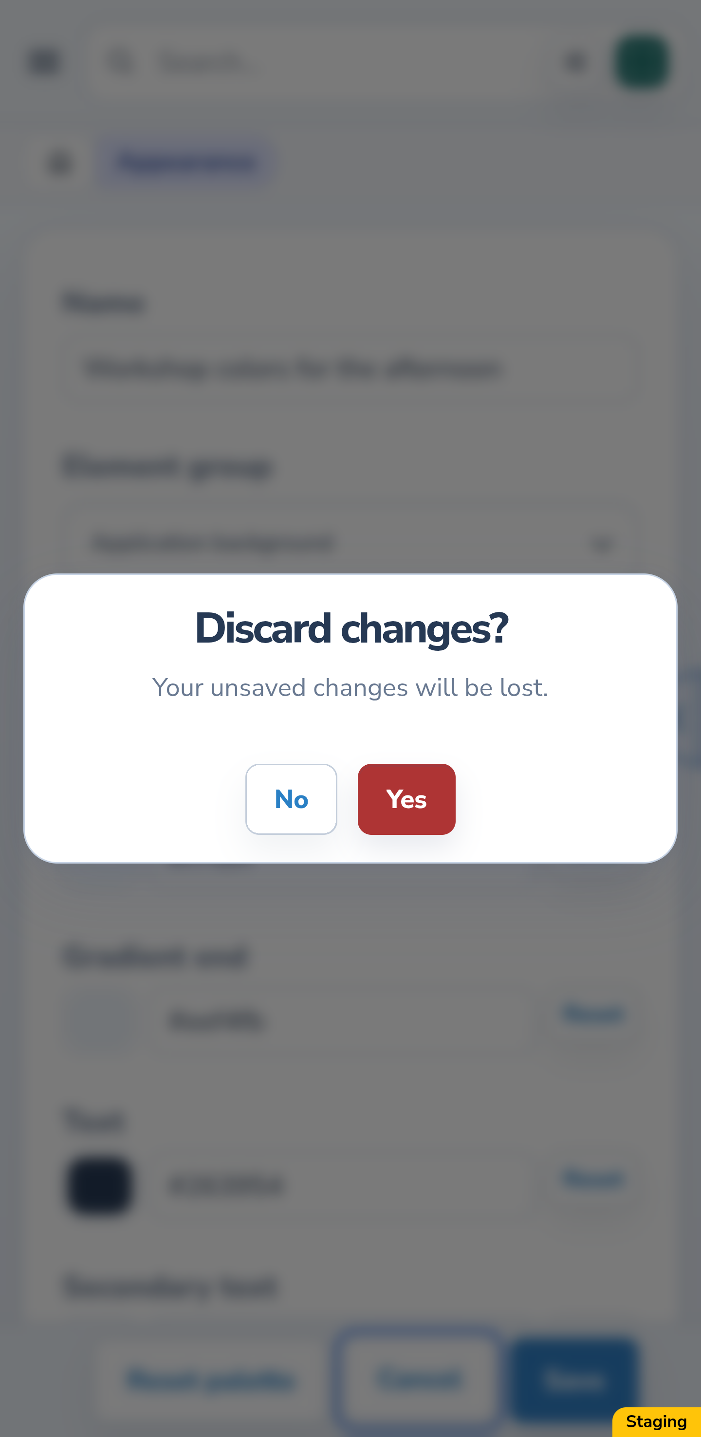
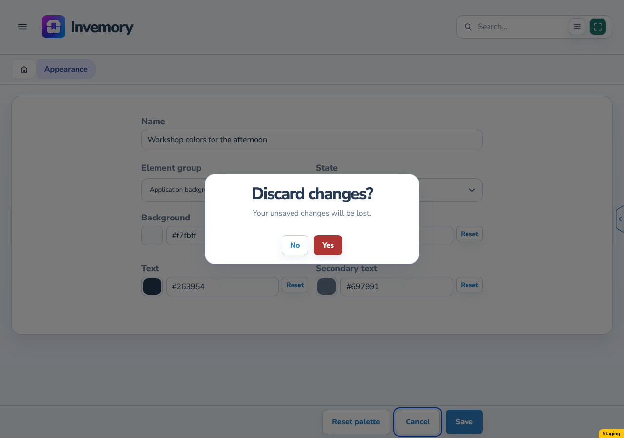
Choose Cancel in the editor. If there are unsaved changes, Invemory asks whether to discard them. No keeps you in the editor with your edits; Yes discards them, ends the preview and returns to the list.
Cancel does not save new colors. Before leaving, decide whether to keep the palette unchanged or return to the editor and save the result you want.
Android
Website
18. Delete an unused inactive palette
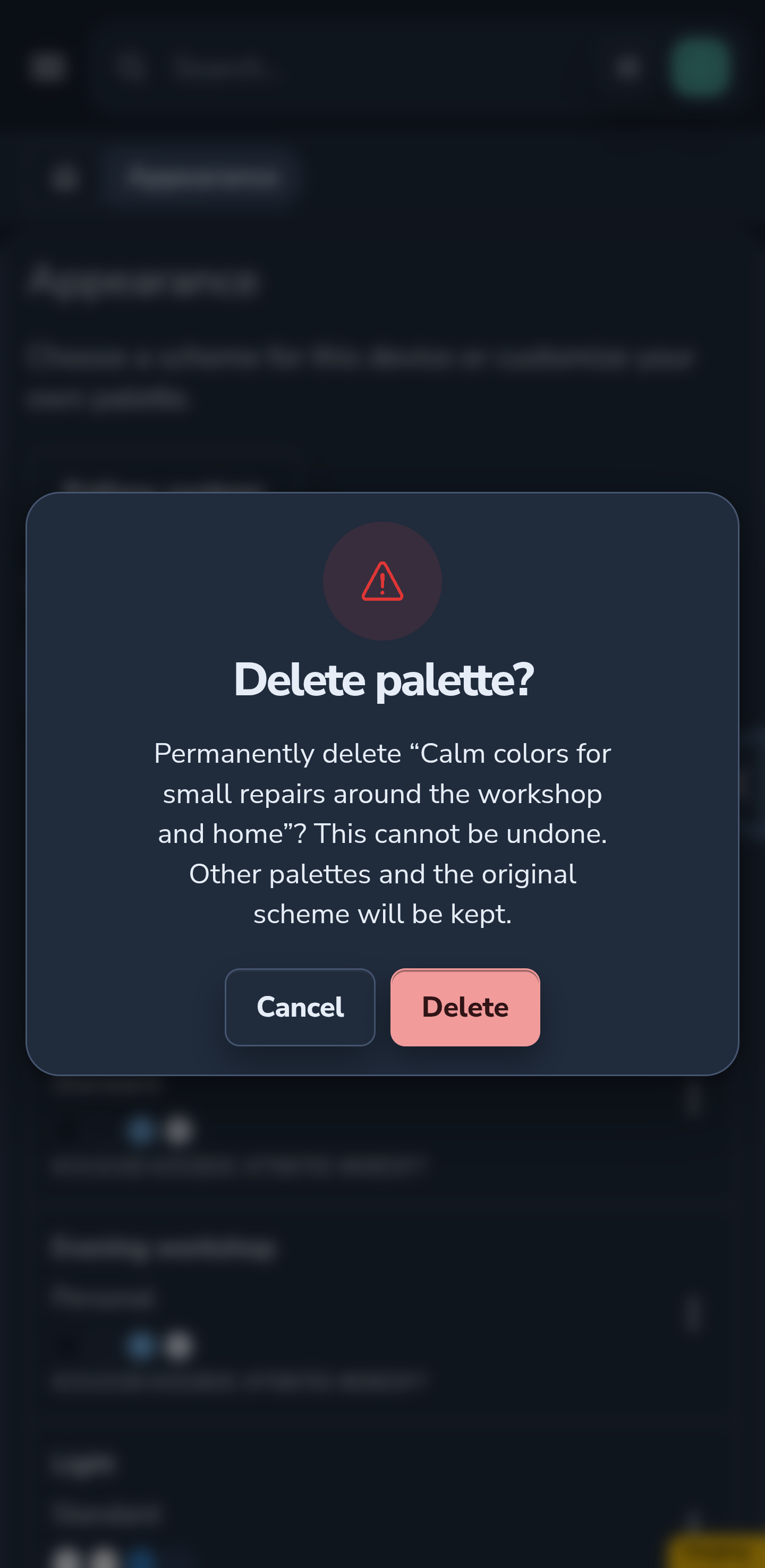
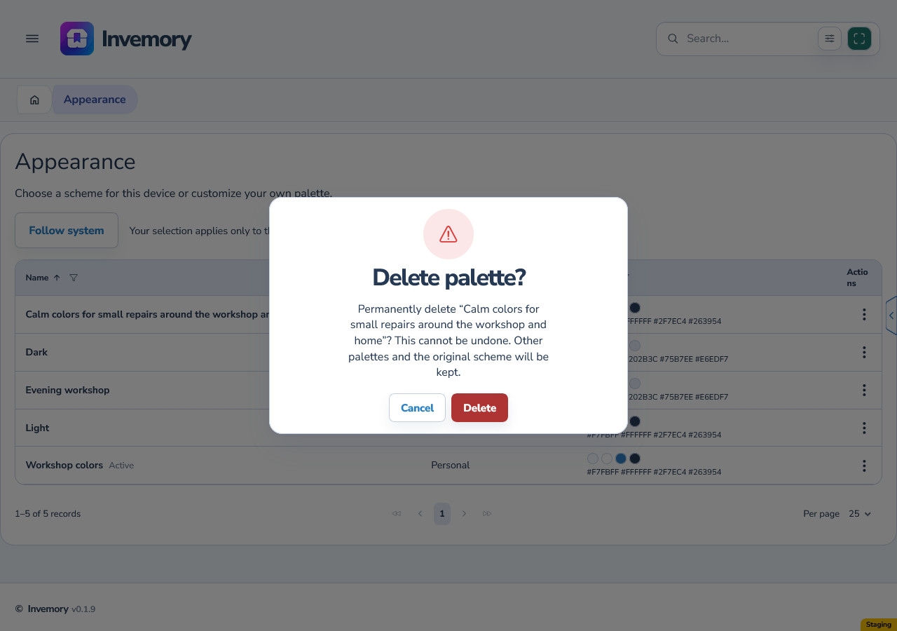
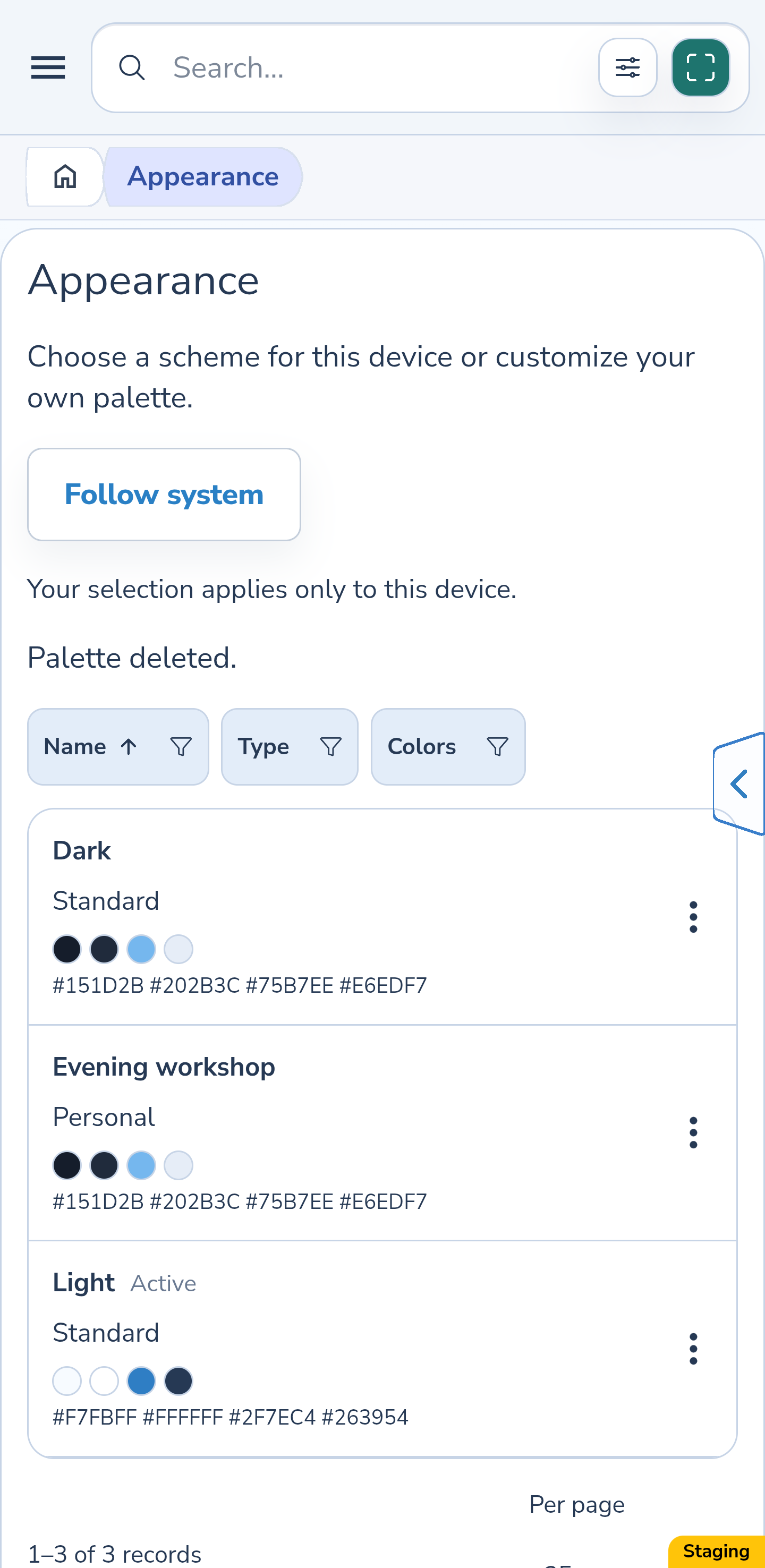
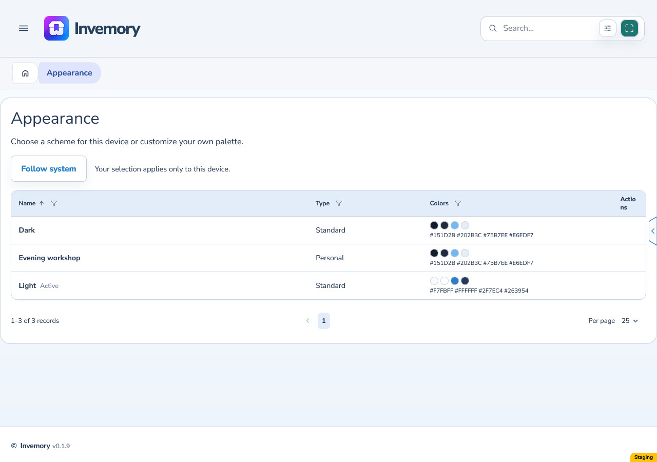
Return to Profile → Appearance, open a personal palette’s menu and choose Delete. Check the name in the confirmation, especially when names are long or similar. Cancel closes the dialog; Delete permanently removes the palette.
Deleting an inactive palette successfully keeps your current selection. The original scheme and other copies remain available. Standard schemes have no Delete action. Deleted personal palettes cannot be restored.
Android
Website
19. Check replacement of an active light palette
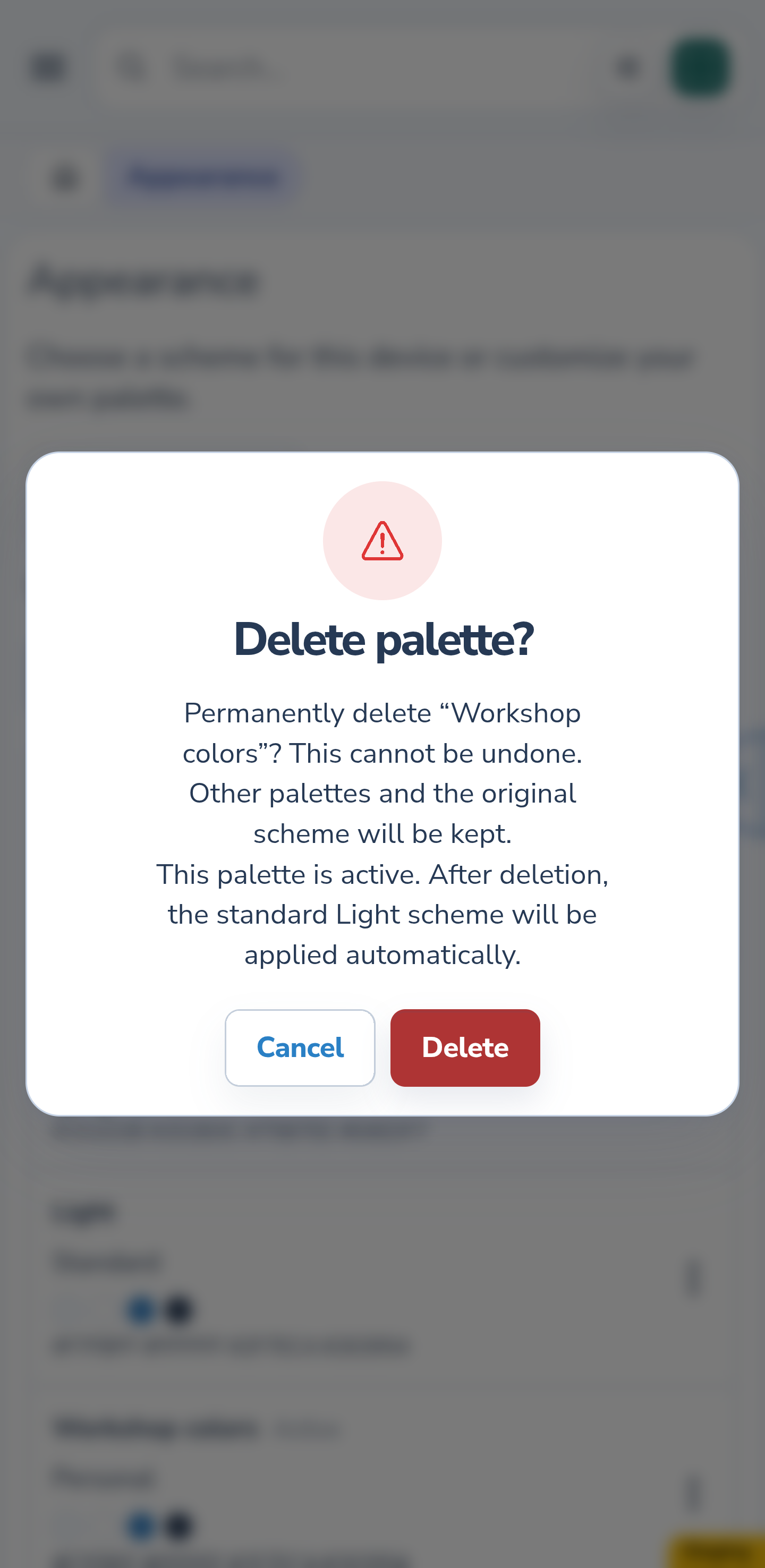
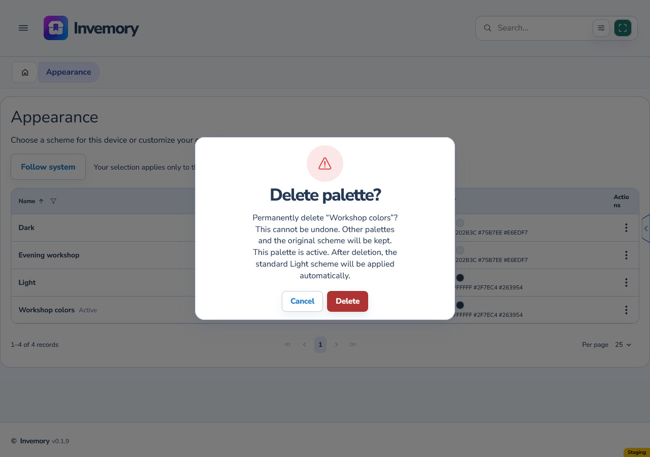
When an active personal palette has a light base, the confirmation explains that standard Light will be applied automatically after deletion. There is no replacement to choose in this dialog.
Only after successful deletion does the personal palette disappear and standard Light become active. Its current colors may differ from the original colors of your copy if an administrator has updated the standard.
Android
Website
Android
Website
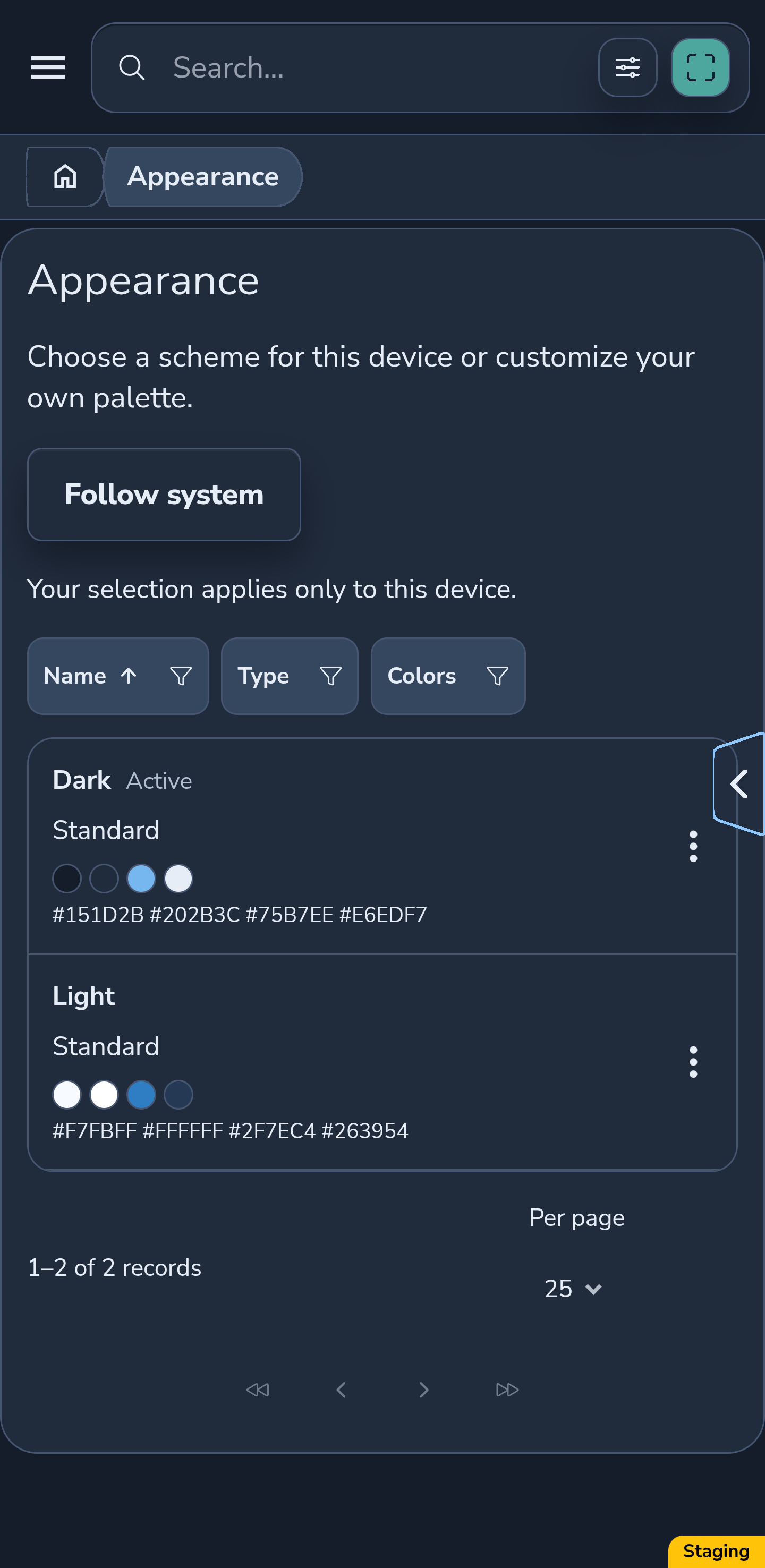
20. Check replacement of an active dark palette
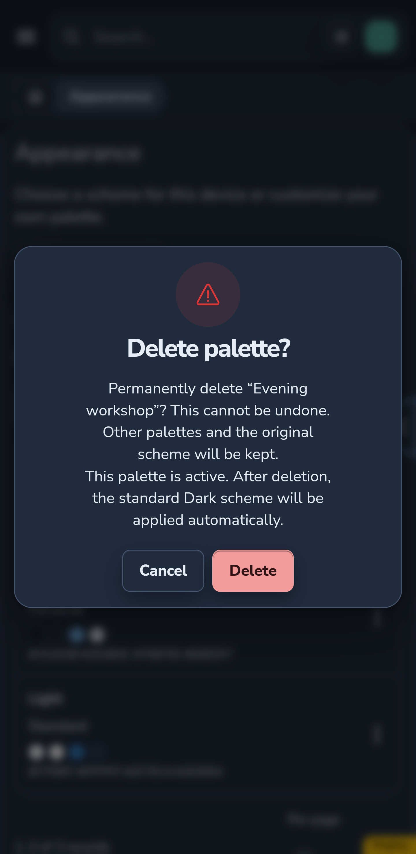
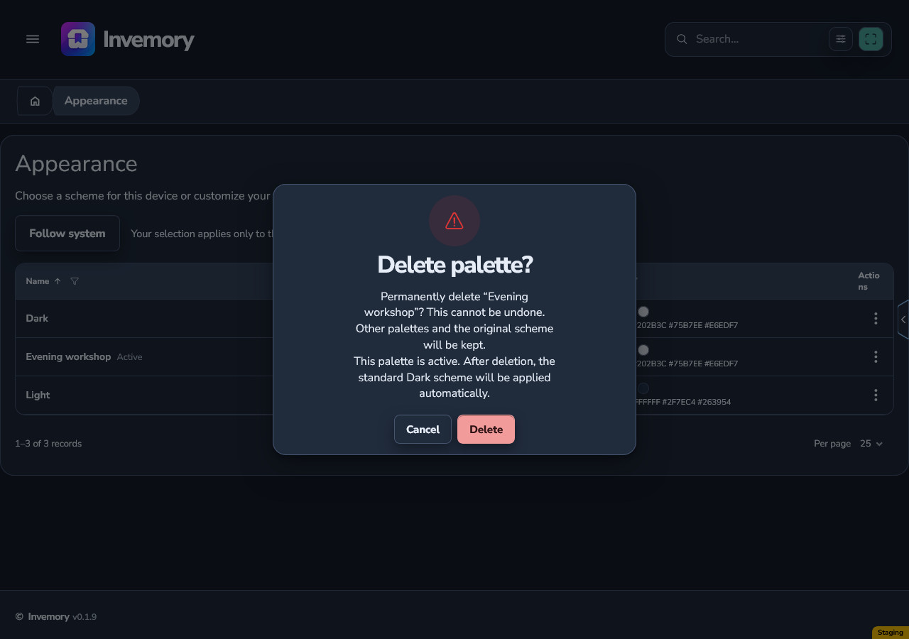
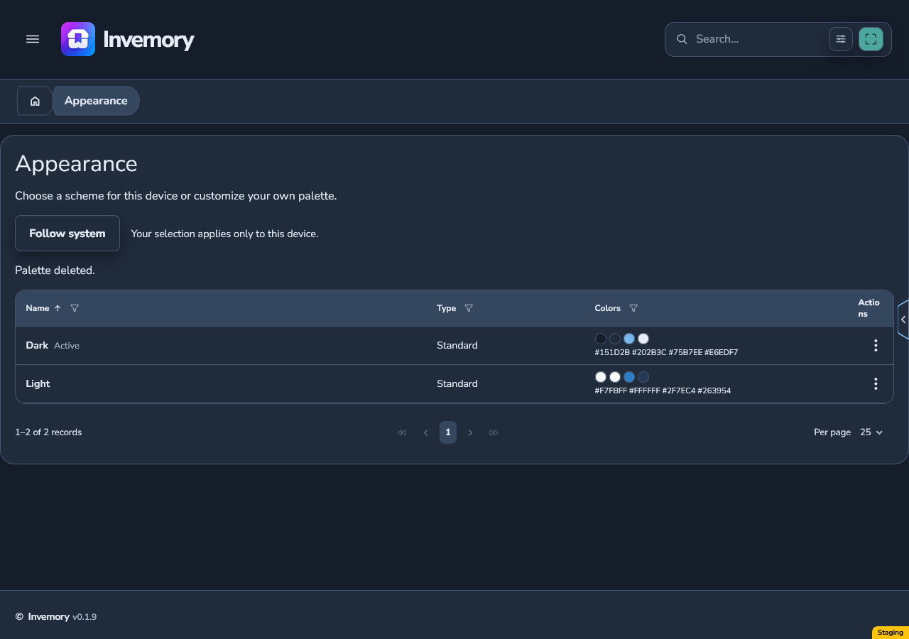
For an active personal palette with a dark base, the confirmation explains the automatic switch to standard Dark. Dark becomes active after successful deletion.
This also applies when deleting your last personal palette: the standard schemes remain in the list. Cancelling the confirmation keeps your current palette selected.
Android
Website
Android
Website
21. Handle a failure and refresh another device
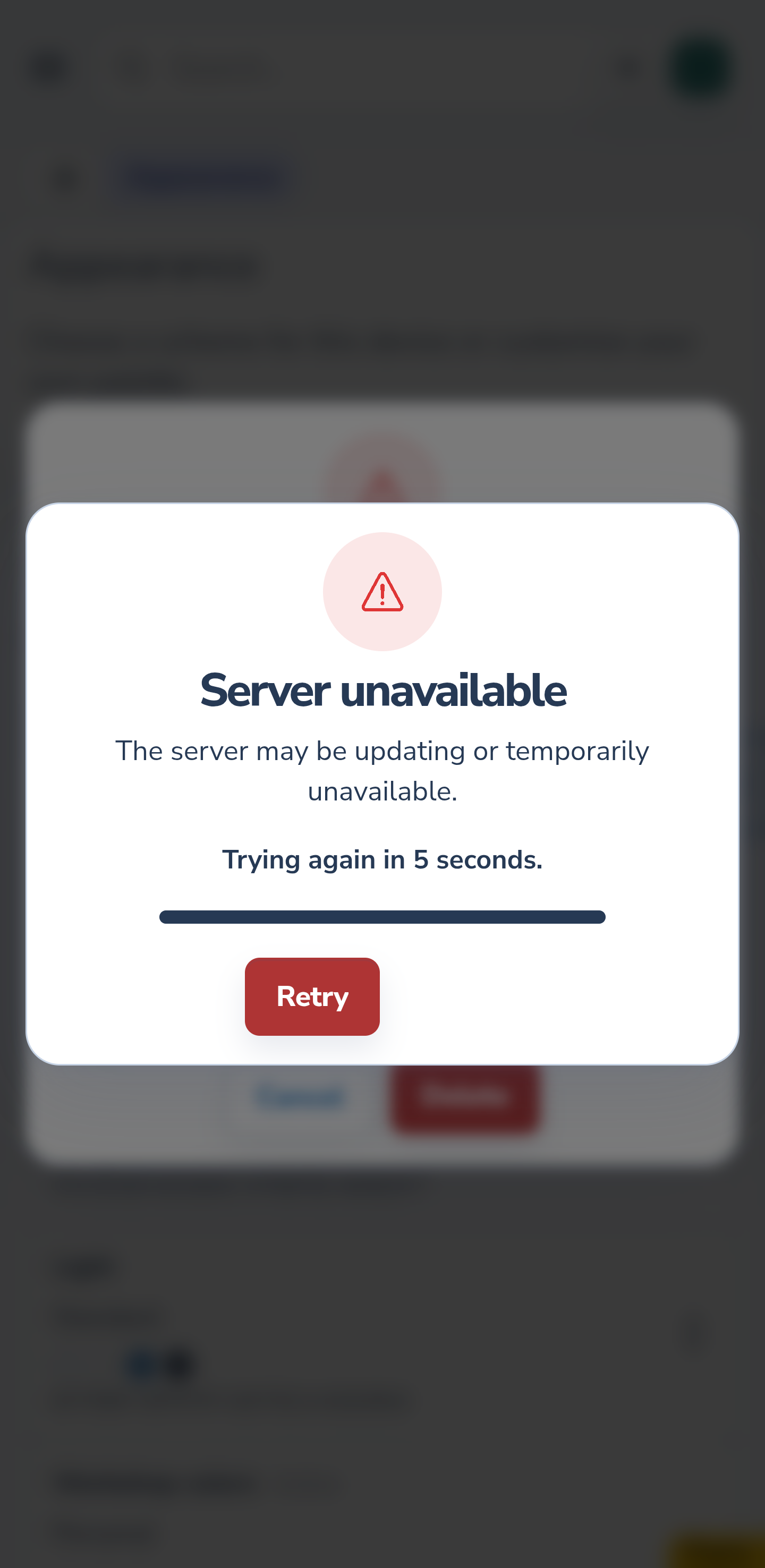
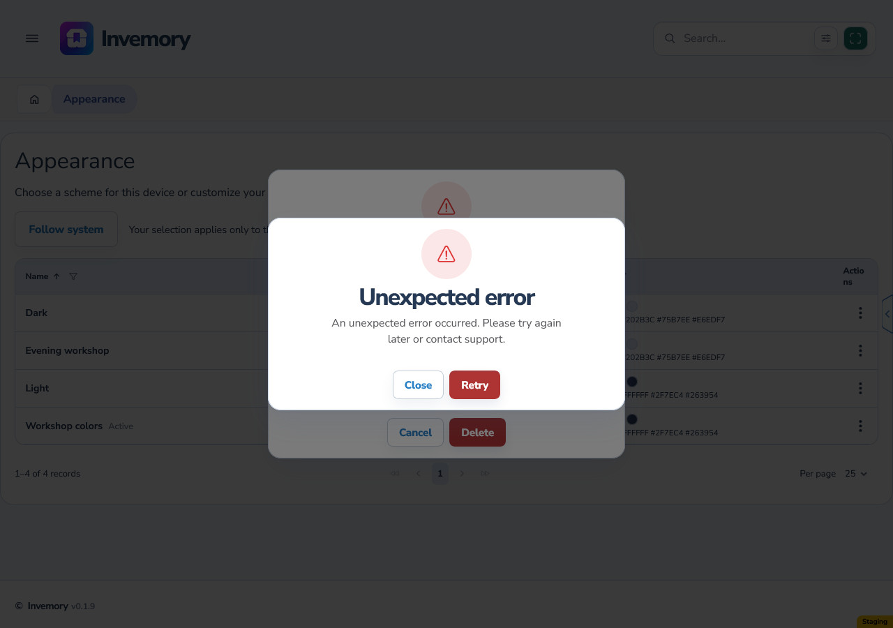
If deletion fails, the palette and current selection are preserved. Read the message, restore your connection and try again. If another session has already deleted the palette, refresh the list to get its current state.
Another device switches to the matching standard after receiving the current catalog, for example when you return to the app. Do not expect every open session to change instantly. Check the Active marker after refreshing.
Android
Website
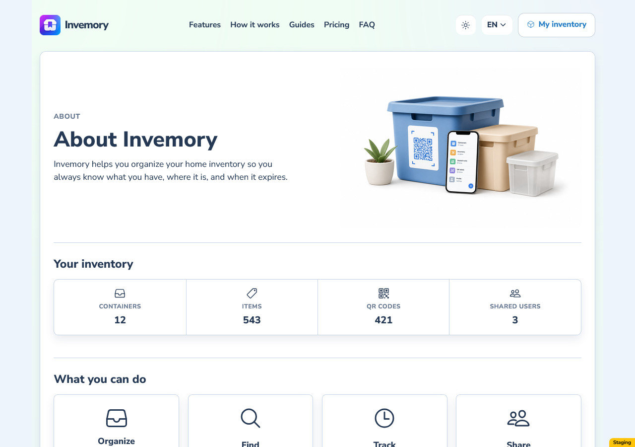
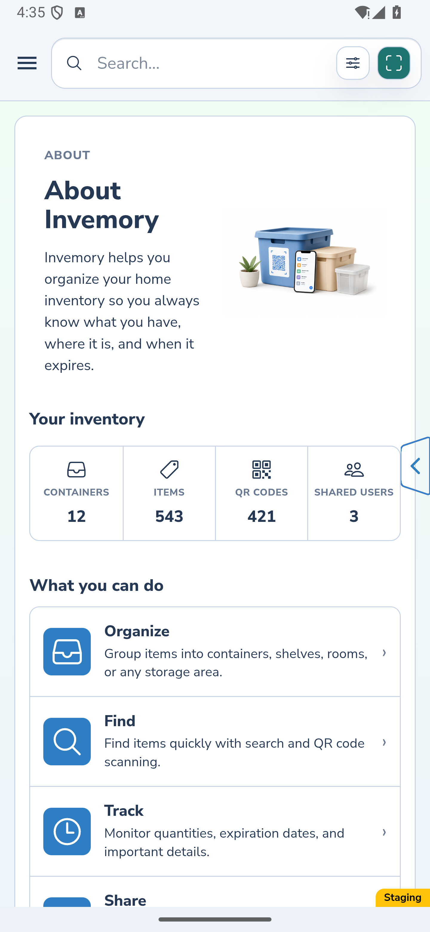
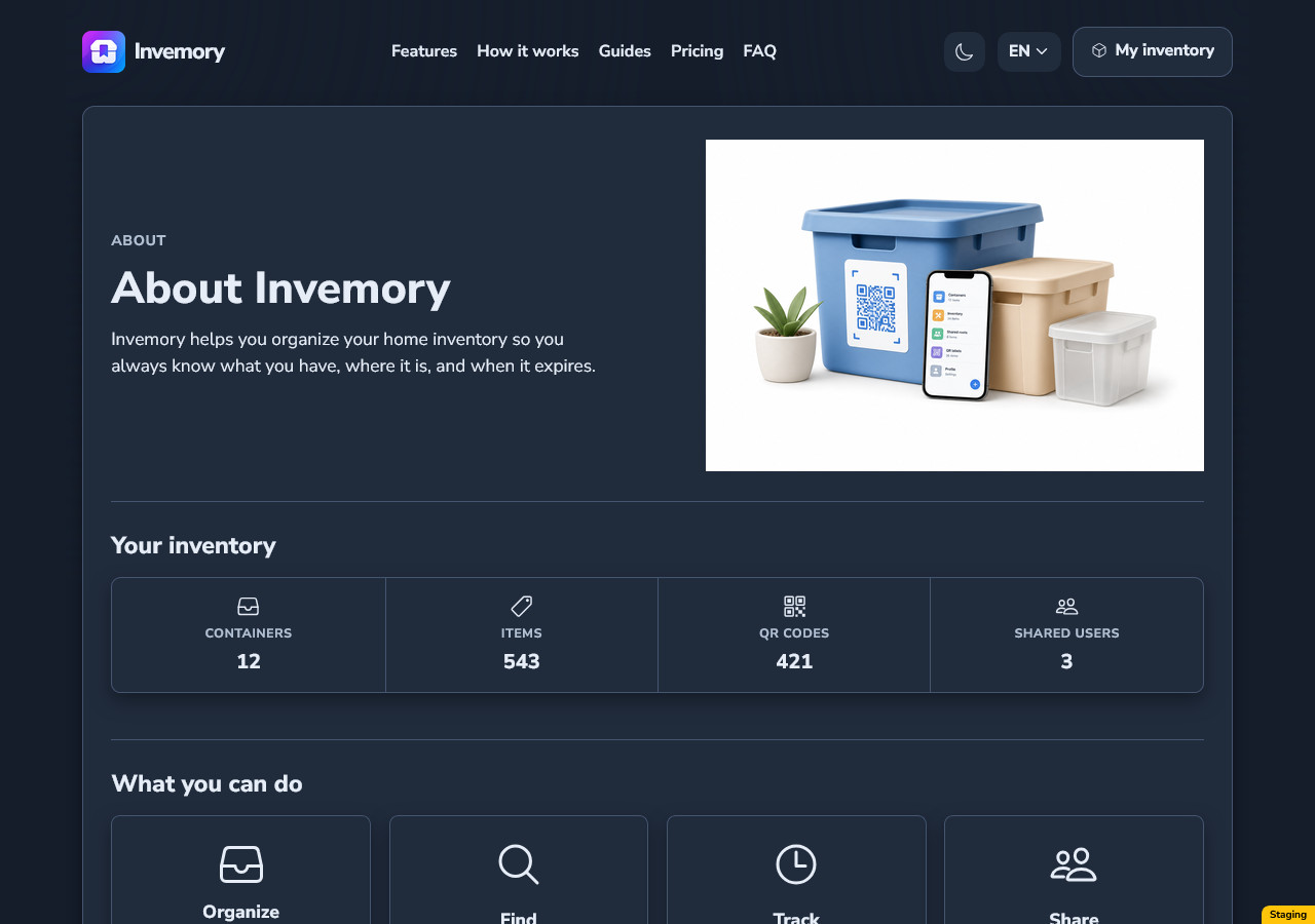
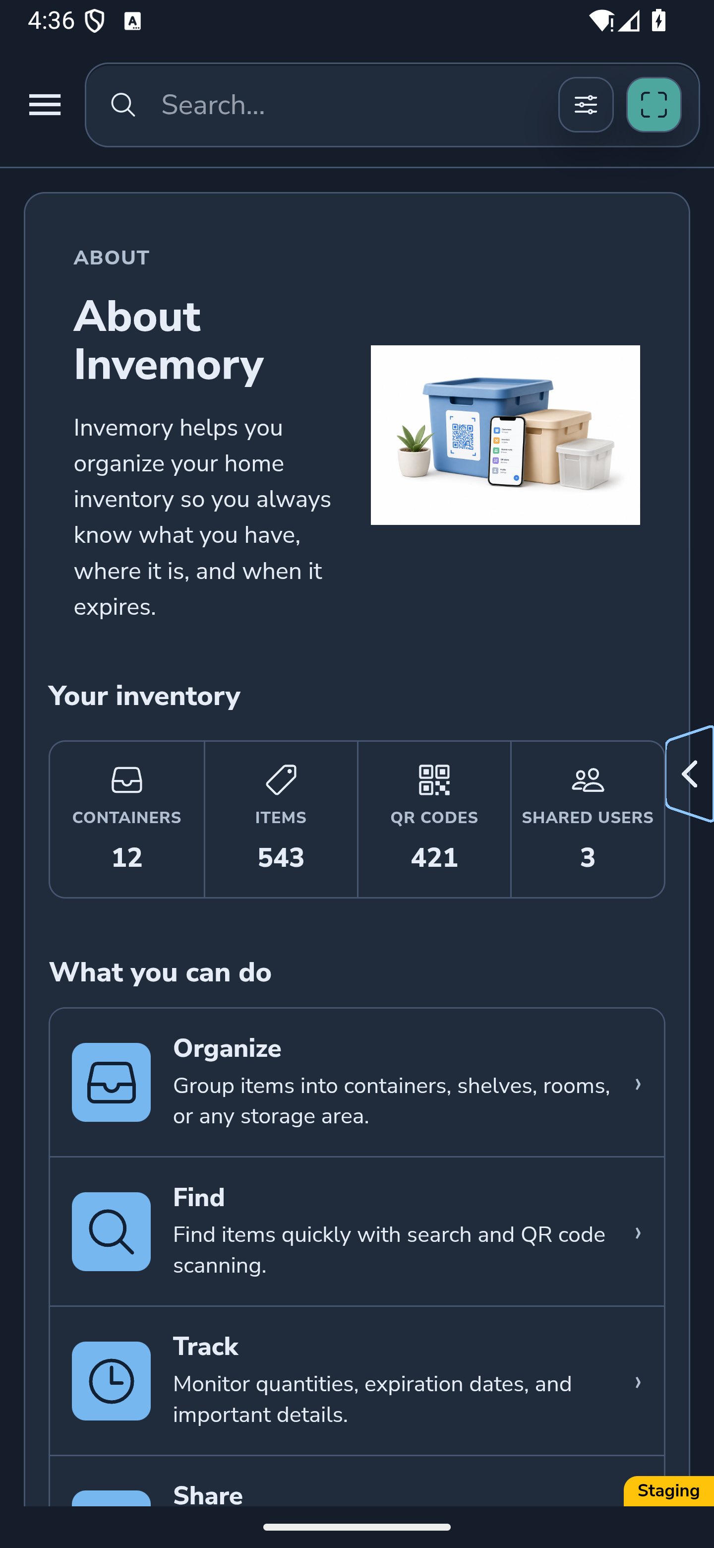
22. Check your scheme on About
Open About with your chosen Light, Dark or personal palette. Text, cards, icons and surrounding surfaces use the active appearance.
Brand illustrations and product photos retain their own colors. Use them as images, rather than expecting every color in the artwork to change with the scheme.
Website
Android
Website
Android
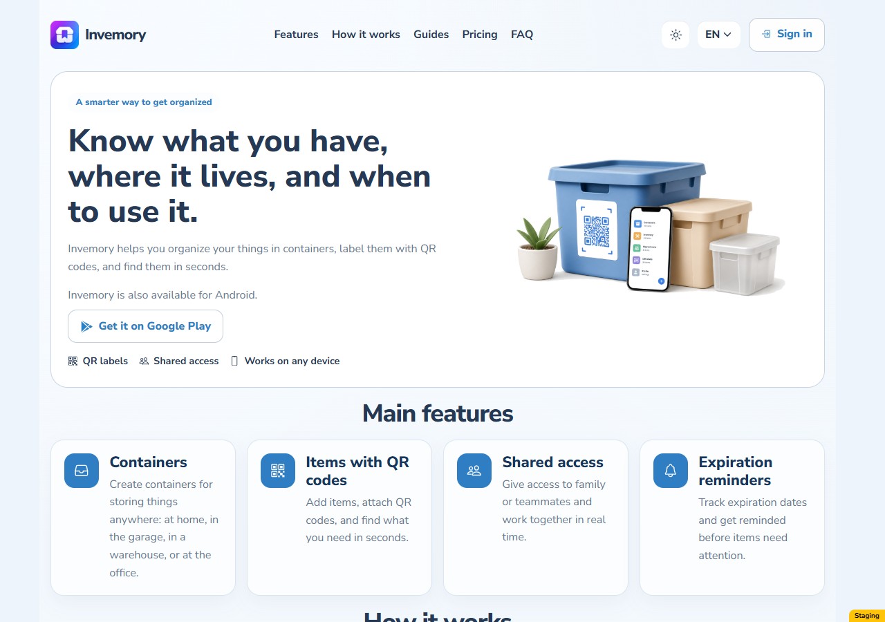
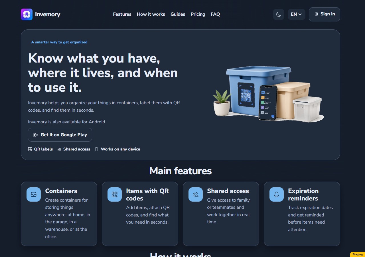
23. Choose a scheme for public pages
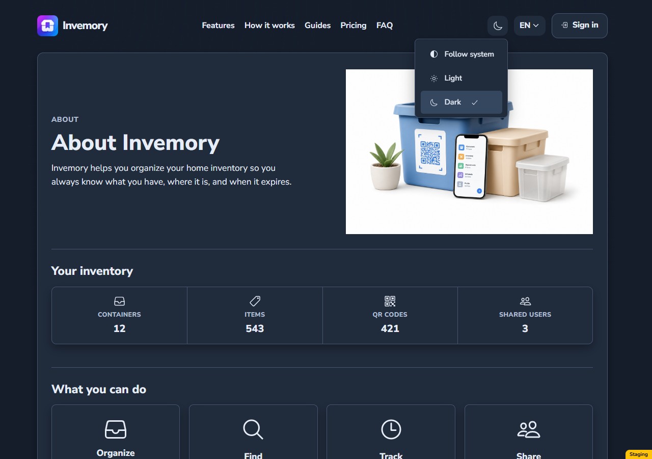
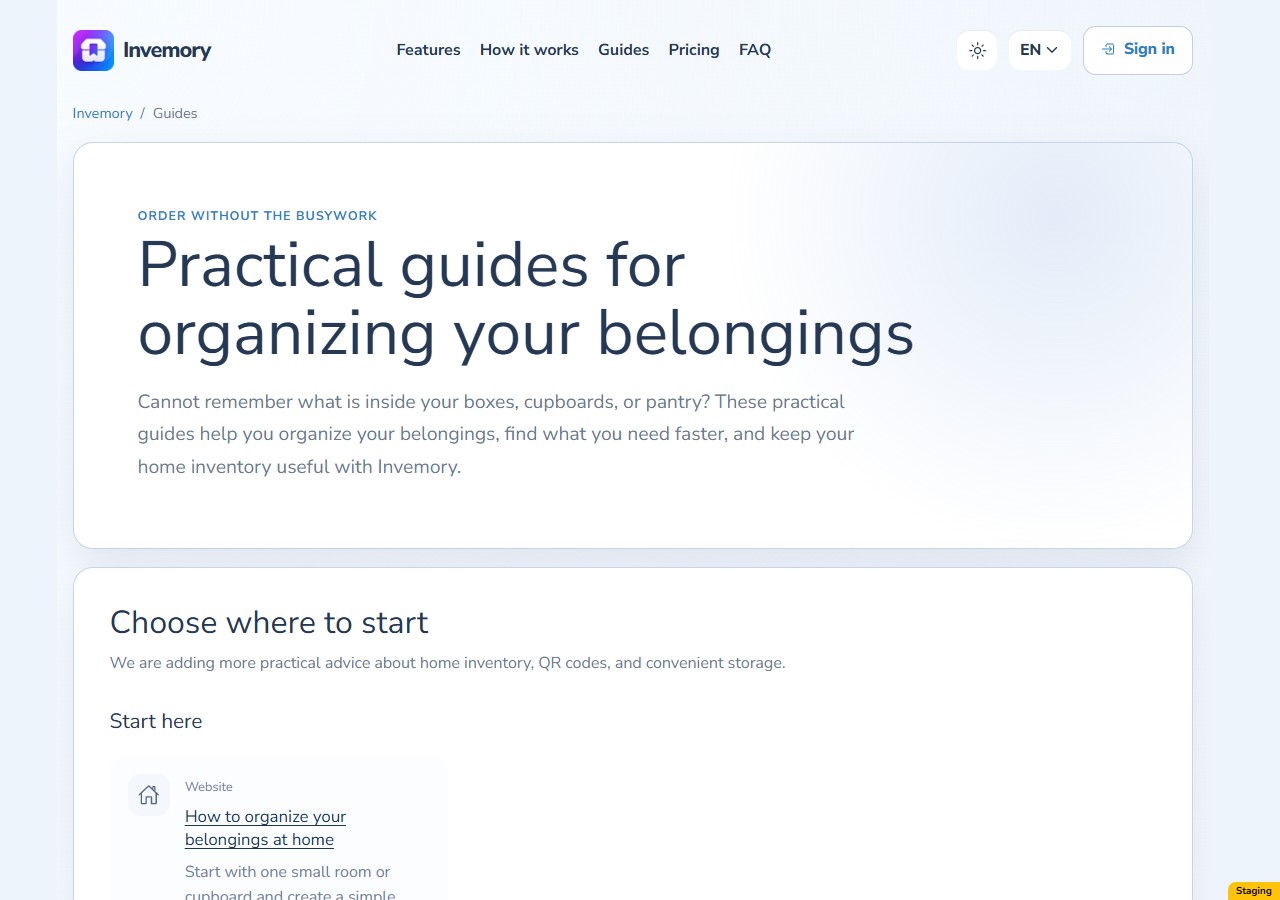
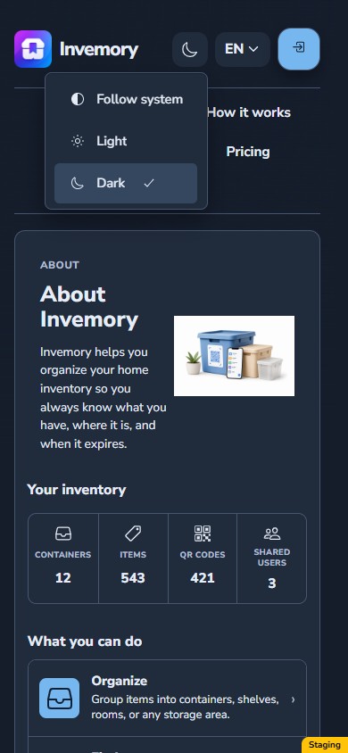
On the signed-out website, open the color scheme selector beside the language control. It has three choices: Follow system, Light and Dark. Follow system uses your system’s light or dark preference; an explicit Light or Dark choice takes priority.
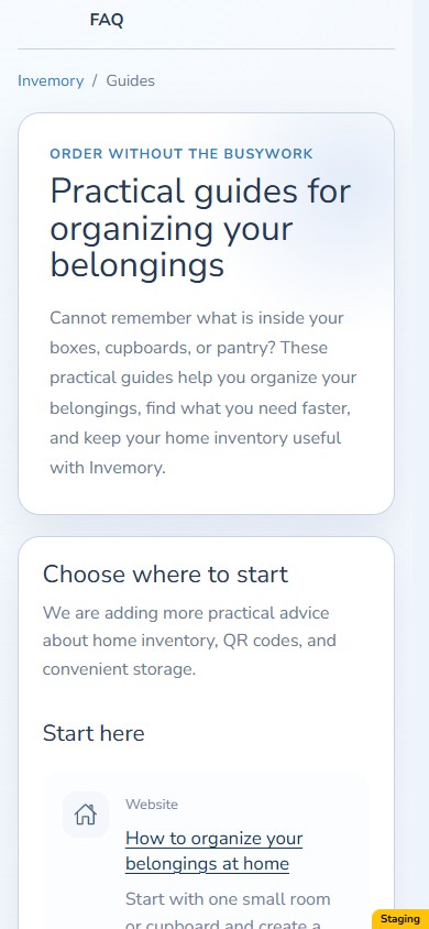
The choice stays in this browser for the same website when you reload or move between the landing page, About, guides, legal pages and public inventory. Select an option or click outside the menu to close it.
The mobile website examples show the responsive website in a narrow browser viewport. To choose a personal palette, sign in and open Profile → Appearance.
Website
Website
Website
Website
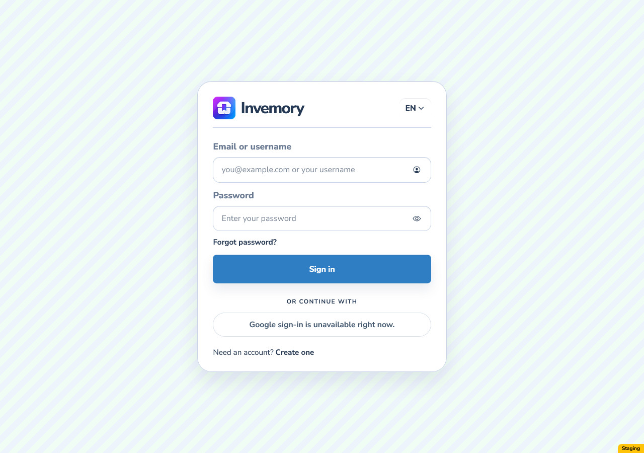
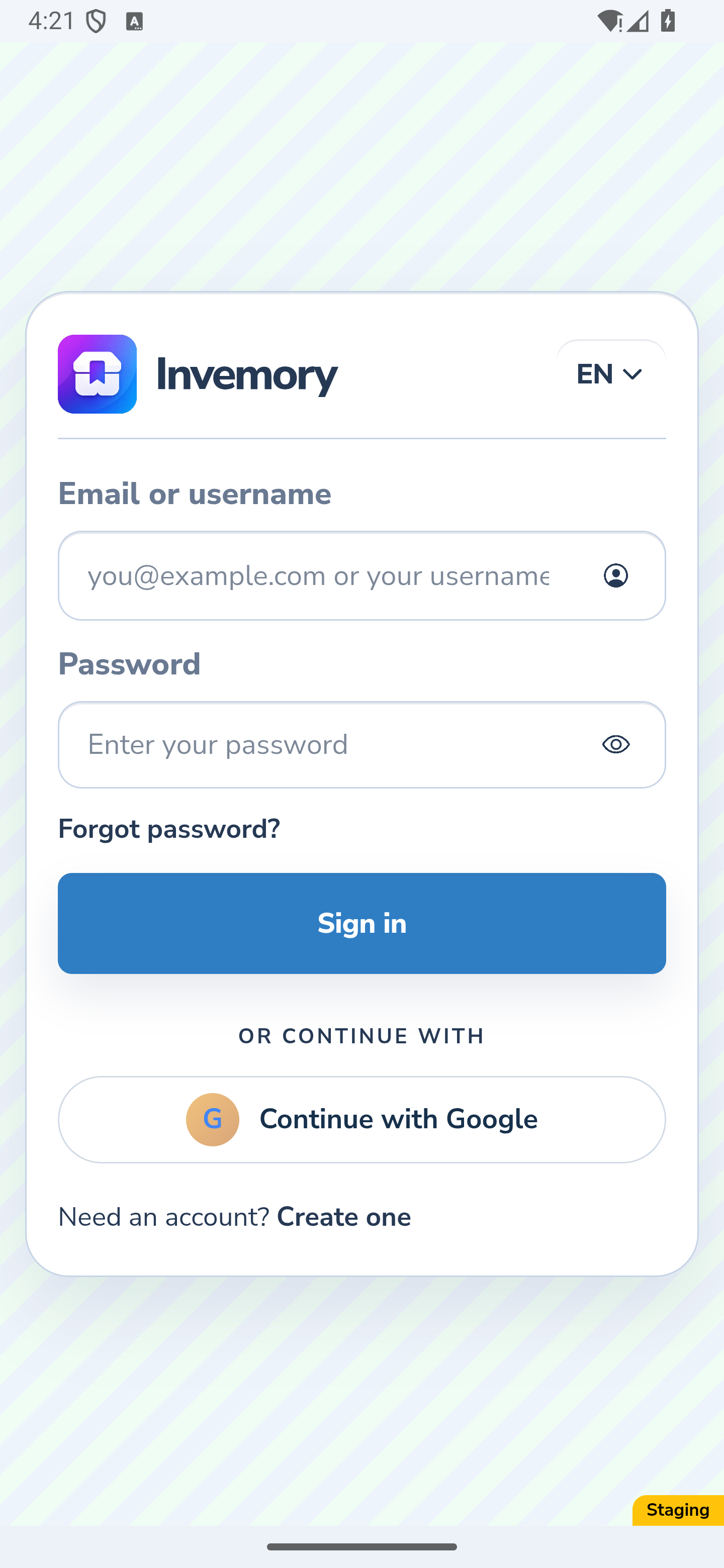
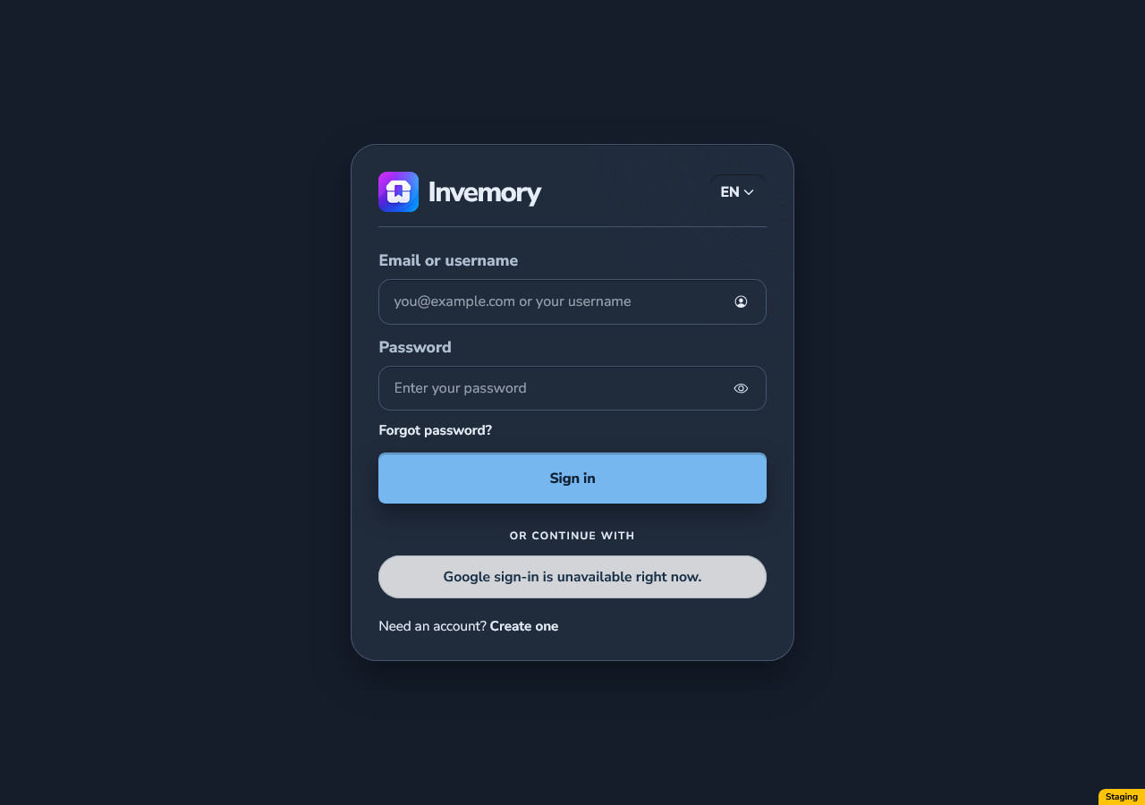
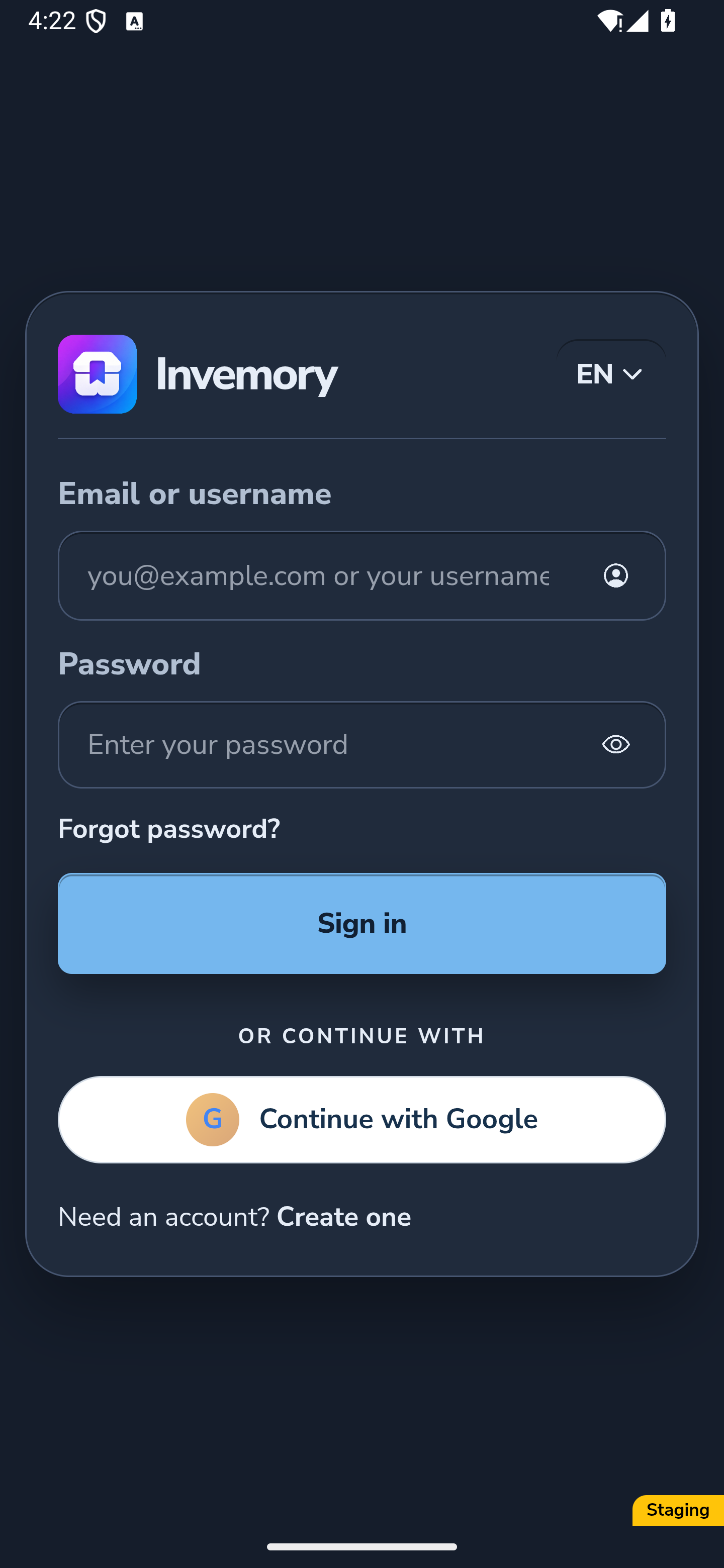
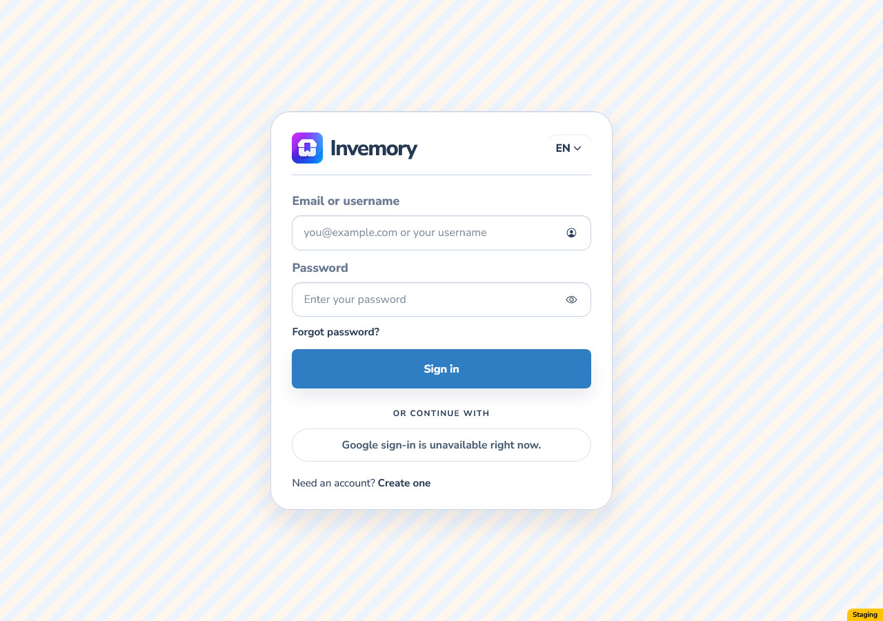
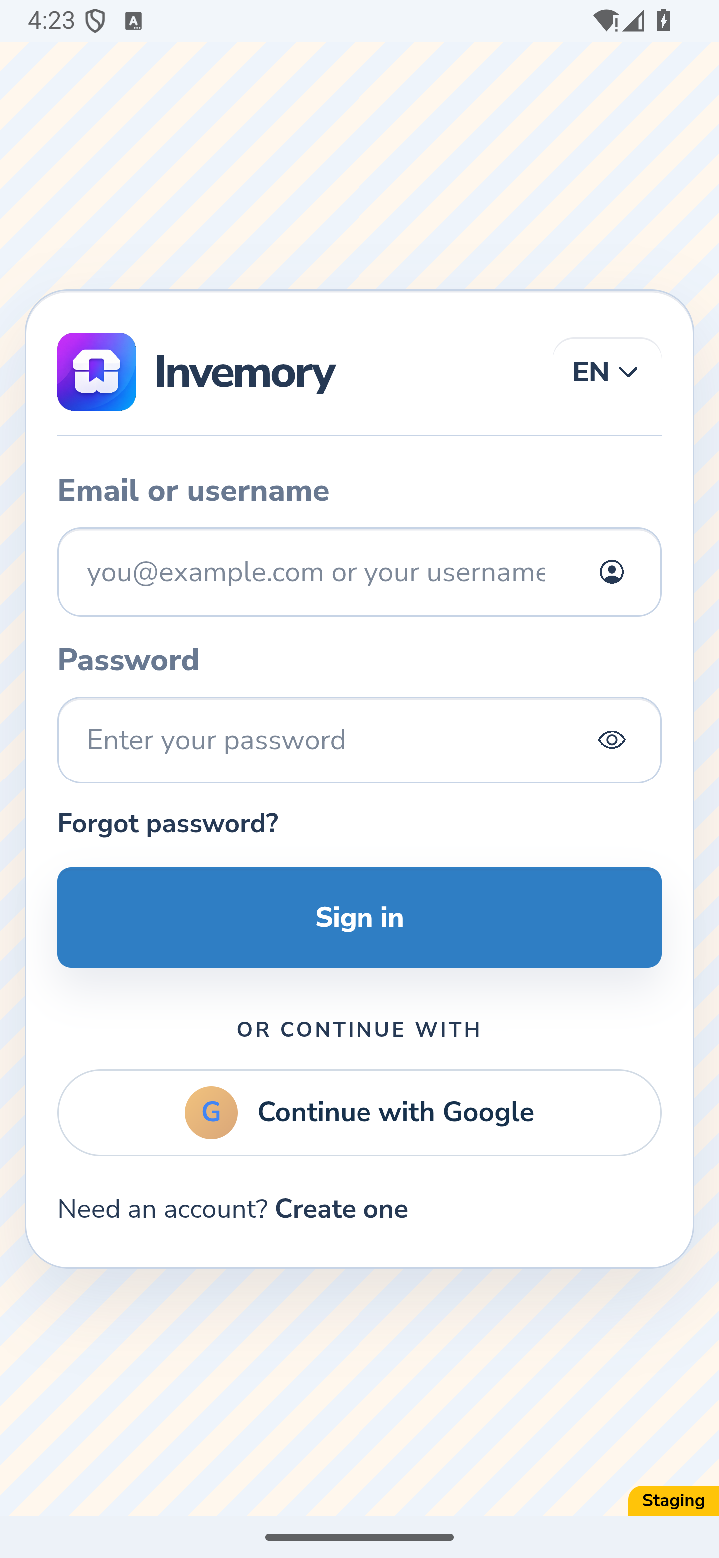
24. Understand colors when signing in
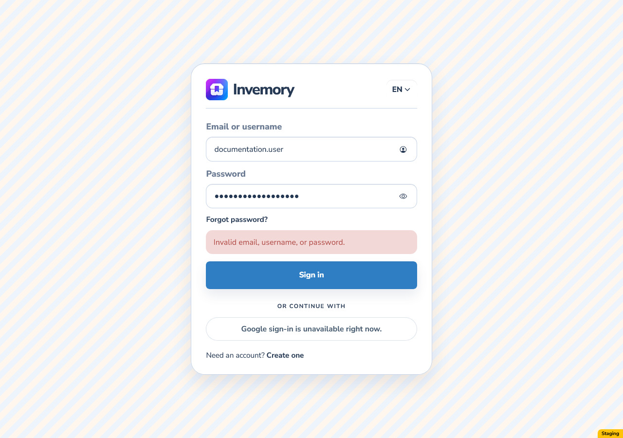
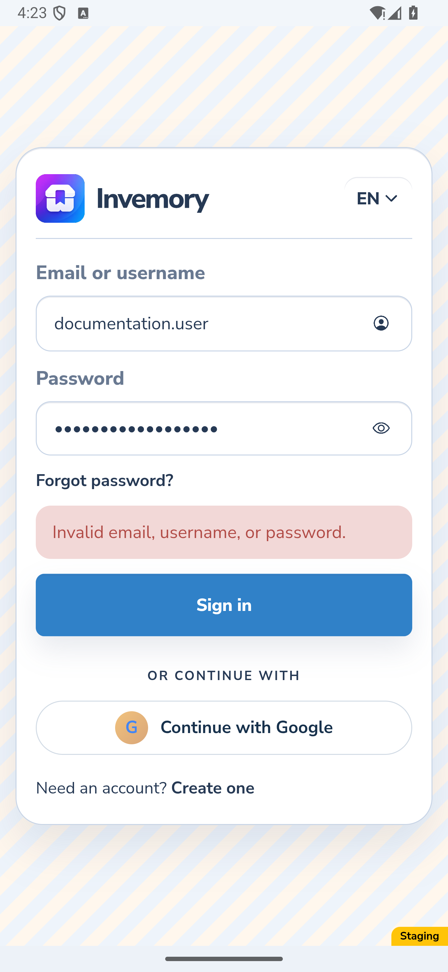
On the website, Sign in from the landing page carries the public Light, Dark or Follow system choice to the sign-in form. After signing out of an account, the form uses that account’s last appearance on this device, including a personal palette.
Check the form’s message if password sign-in fails. The tested website and Android password forms kept the selected appearance while showing the error.
Website
Website
Website
Android
Website
Android
Website
Android
Website
Android
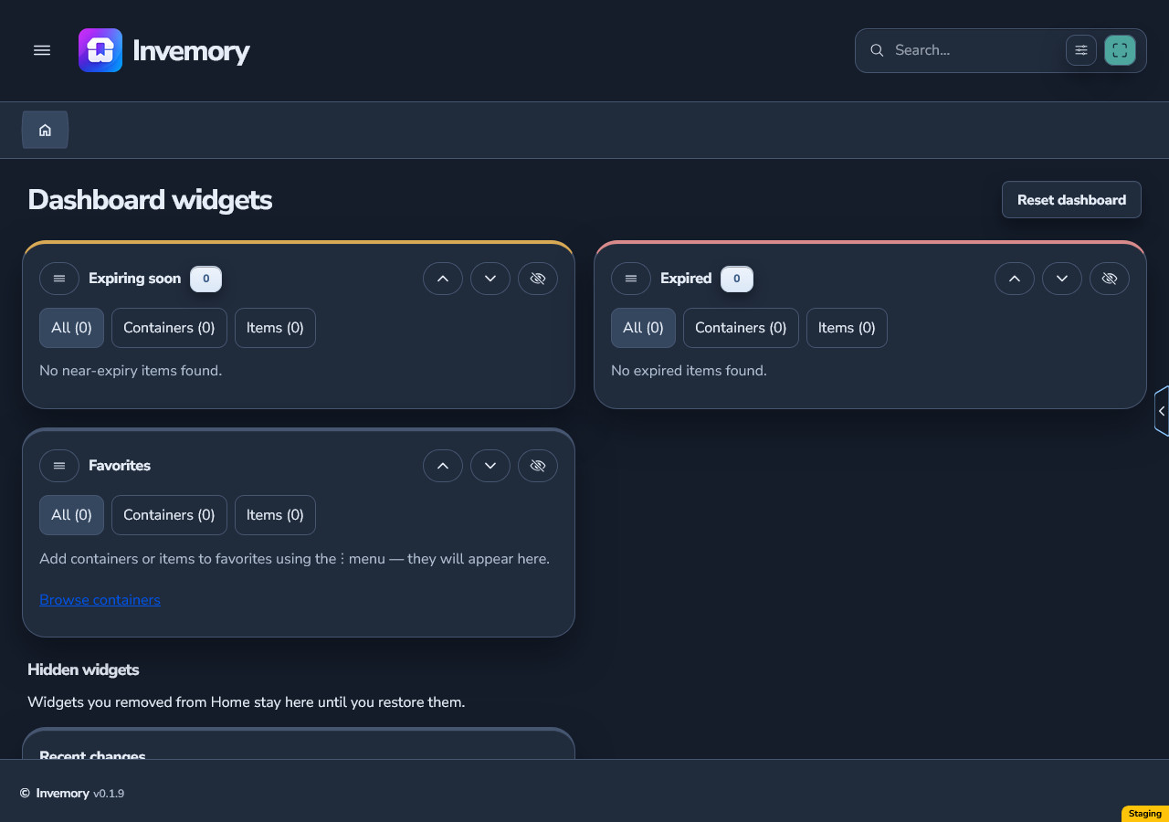
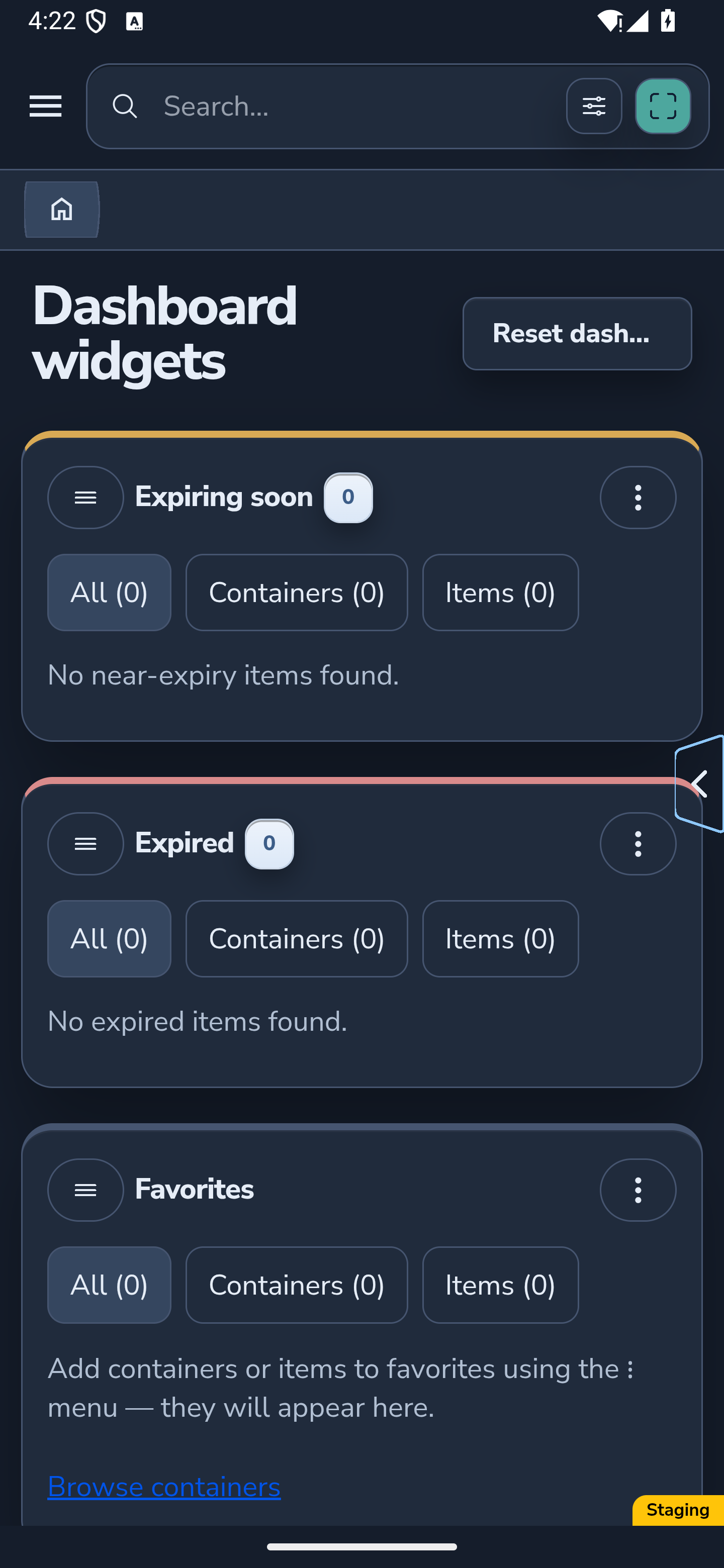
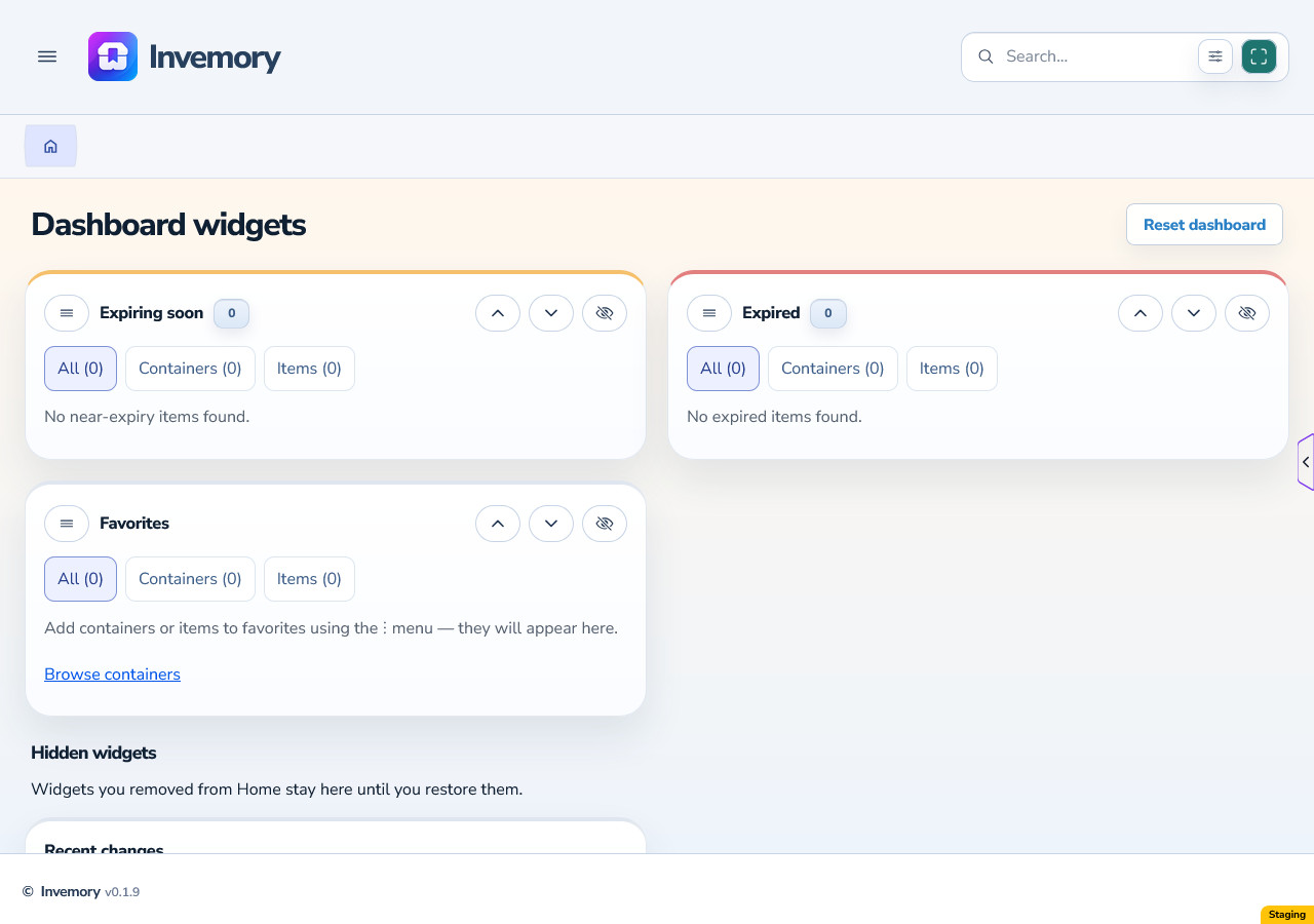
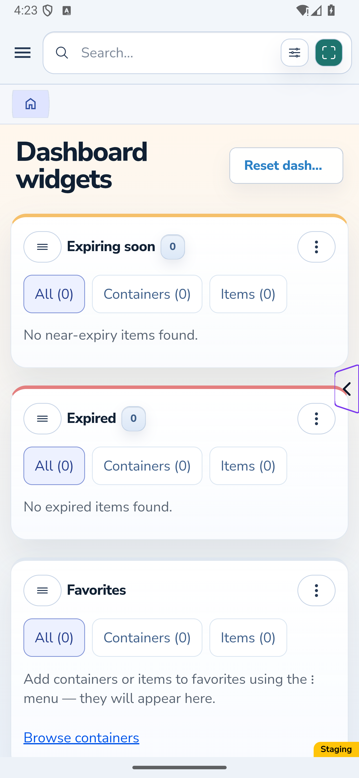
25. Check your account appearance after sign-in
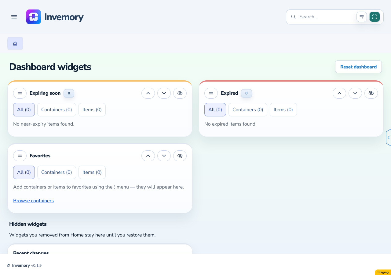
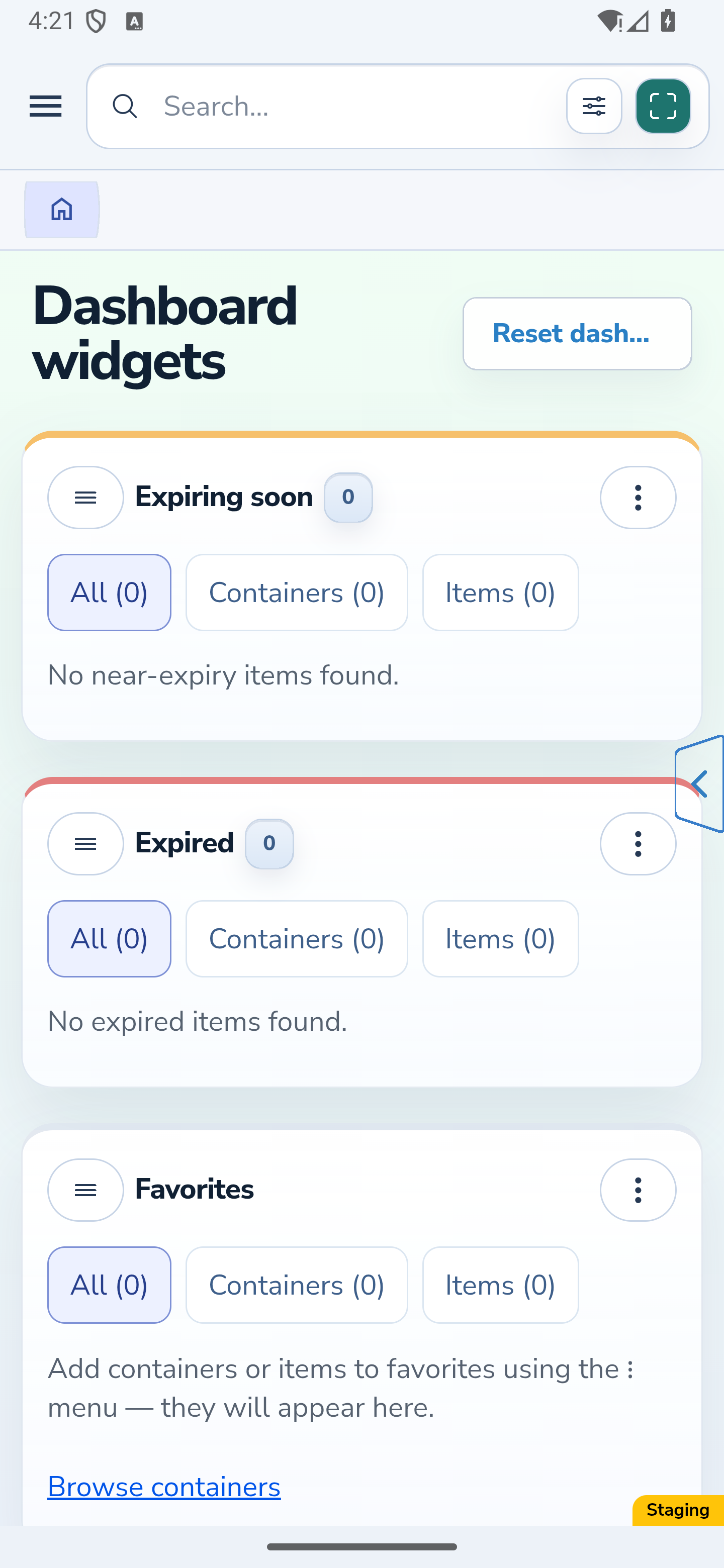
After password sign-in, check the ready Home page: it uses the account’s selected Light, Dark or personal palette.
Website
Android
Website
Android
Website
Android
The result
You can save and apply personal colors, remove unused palettes, and keep priority, hint and photo indicators easy to distinguish. You can also position the quick access handle, adjust its separate device setting and choose how public pages look.
Useful to know
- Check text, icons and borders on real forms; similar colors can be difficult to distinguish.
- Publishing a standard scheme does not overwrite your saved personal colors. Newly added missing fields can receive base colors.
- Changing the interface language does not translate your palette or item names.
- Language, date and currency settings are available separately in your profile settings.
- Check the handle’s arrow and border against the content behind it, especially with high fill transparency.
- Wait for the saved-on-this-device message after changing handle transparency. This setting is separate from palette Save.
- Use the color scheme selector on the mobile website; use Profile → Appearance for a personal palette in the signed-in app.
Common questions
Why is my new palette saved but not active?
Saving a new or inactive palette and choosing an appearance are separate actions. After saving, open its menu and choose Apply.
Can I change a standard scheme just for myself?
Clone it and save a personal palette. Only an administrator can edit standards directly, and those changes affect everyone using them.
Can I recover a deleted personal palette?
No. Check the name before confirming. If needed, create a new copy from an available scheme and customize it again.
What does Previous restore in the color picker?
It restores the color that was present when you opened this picker, including transparency. It is not a history of palette saves.
Why did handle transparency stay after I canceled the palette?
Handle transparency saves automatically for your account on this device. Palette Cancel discards palette edits and does not undo a successful device save.
Why does the public selector show Light or Dark for my personal palette?
When you are signed in, it indicates the personal palette’s light or dark base. The account palette remains the source of your colors.
How do I choose a scheme on the mobile website?
Open the color scheme selector beside the language control and choose Follow system, Light or Dark. The mobile website illustrations show a real responsive browser viewport; the Android app illustrations show the installed app.
You can save and apply personal colors, remove unused palettes, and keep priority, hint and photo indicators easy to distinguish. You can also position the quick access handle, adjust its separate device setting and choose how public pages look.
Open my Appearance settings